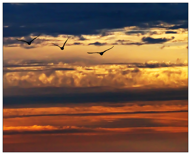
I would have liked to use this photo showing more of the sunrise, even as it is I think a few might not like the rule of thirds. I based the intersection line across the body of the middle bird. Also there is a section of blockiness in the blue at the top.
I had 2 curves adjustment layers one for sat one for light / dark. Also a levels adjustment layer. Applied various USM and NN to achieve this result (and I'm still not entirely satisfied with it)
Statistics
Place: 17 out of 320 Avg (all users): 6.5676 Avg (commenters): 8.0714 Avg (participants): 6.3152 Avg (non-participants): 6.7462 Views since voting: 2764 Views during voting: 321 Votes: 222 Comments: 19 Favorites: 5 (view)
You are correct, the blue looks a bit over processed.
I really like the sihouttes of the birds. However, my eye keeps getting drawn to the band of white clouds that run across the center with all the detail there. The brightness there, especially in the right third of the frame, is a bit distracting.
Color saturation and hue, is done very well. Focus is spot on. A little more softness in the clouds would keep the eye on the birds.
Overall this is a very well done photo, and I add my congratulations on your top 20 finish.
I feel the bands across the sky make this a difficult choice for a good ROT photo. Against a clear or even slightly cloudy sky you would have it. Nice photo and the placement of the birds works well.
I like the idea of the birds flying into the sunset, but this shot may have been better if it was a little bit lighter. The birds kind of almost blend into the clouds





 Add photograph to your favorites
 Add photographer to your favorites

 Photographer found comment helpful.


