I think this would have presented itself better had it been a bit softer and toned-down, as the high contrast renders this a bit too harsh in my opinion.
vivid, but the speckles I don't care for. Might be port of the flower, maybe hair or something, but just doesn't seem smooth this image seems it would be nice smooth and seamless.
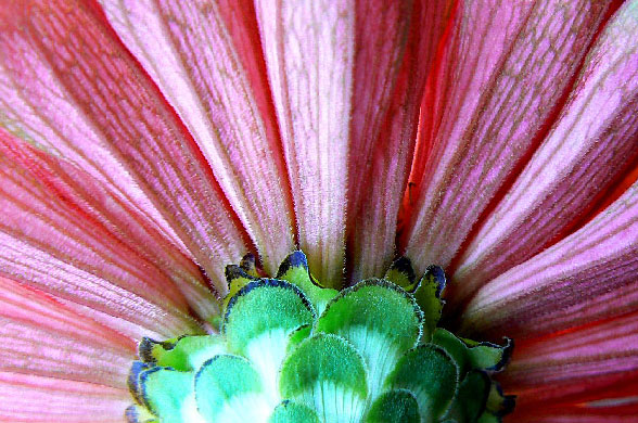
I think this is a very good idea for an abstract. The focus on the petals and the blown spots, particularly in the lower left center (in the green) are both unfortunate in my opinion. I like the way the fan of petals takes up the entire frame. Beautiful symmetry portrayed here.
Composition: 5 - The centering works here, it kind of resembles a hue shifted Macedonian flag!
Technical: 3 - The bottom part seems over exposed, and the rest seems a bit dull, contrast-wise. The also leads to teh colours not having the impact they could. Also, I think you could have easily used the 720 pixels available for this challenge.
Creativity: 3 - Its an unusual crop of a flower, and from underneath, but other than that it doesn't have a lot of creativity.
Appeal: 3
I just LOVE this.....the colour contrast is so powerful, and the whole photo just has such 'pop'. Only thing is, I wish you'd used your whole size allocation, and made it a bigger photo, and perhaps toned down the highlights to the left of the picture. But very nice....well done.






 Add photograph to your favorites
 Add photographer to your favorites


 Photographer found comment helpful.


