You have some wonderful images that you've submitted to challenges so far and though they were tempting to comment on I decided to go with this one since it wasn't quite as well received as the others.
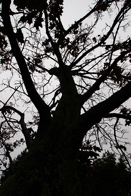
What I like about this image is the strength visible, both in the depth of the silhouette (some folks' silhouettes aren't true black and seem weak for that and other reasons) and the choice of subject that has an inherently strong aura.
I agree with scarlett about the abstract feel to this, it is clearly a tree and its branches yet the scattering of lines and dollops of shapes from the leaves still allow it to hint at abstraction. When I look at it I see a tree but I also get an impression of an ink spill where you have a large blob then the rivulets spreading out in many directions.
I also like the fact that your background isn't glaringly white. The greyish tone of the overcast sky allows the black to be strong but doesn't attack the eyes like a more blown out sky might - the contrasts are still there to be enjoyed with out a visual assault.
Mind you a blown out pure white sky can be a perfectly fine background, I'm just liking the one here, though I wonder if the background was a 'pure' white if that would've struck the voters more positively as the grey does make the image a bit more subdued that some voters tend to like - at least in my experience. If it were possible to lighten it up just a bit without losing the nice smooth greyness, that might be the best of both worlds.
Something I don't like is the composition. Not entirely of course, as I mentioned before there are aspects I do find very strong and that I can find correlations to other things with, but my main issue with the composition is the bottom portion.
I don't find the hedge/bushy tree at the bottom to be nearly as strong or intriguing as the branches are and the current arrangement doesn't allow for that part to add to the image IMO. If the branches seemed to mesh with the bushier tree and look as if it was naturally growing from there, it might work more for me, but the nature of the bushy tree doesn't really allow for that - the piney-jagged stuff doesn't really gel with the branches.
I think cropping out a fair portion - or all if it if possible - would bring the attention to the main subject of the branches and give the image a slightly different dynamic, leaning more towards the abstract nature as well.
There is also something missing from the shot, a "wow" factor that is typically looked for in the challenges, I'm not sure if its the low lighting muting the image too much or something else. I think it has all sorts of great qualities yet as much as I like those individual aspects, when they pull together for the image, its almost like they get homogonized and lost in the whole of the shot. I really wish I could pin point an action that would push the image to the next level but I'm not sure what it is. I'm guessing a more dynamic lighting (while keeping the silhouetting of course) might be an idea but that's just speculation.
I don't know that this has been of any actual help, since I haven't really given many concrete issues and solutions but for what its worth I think the shot was likely rushed through in many cases during the voting, I think if more time was spent the more subtle areas of interest would've become apparent and your score would probably have been a bit higher, I don't think it is a 4.5 shot in my humble opinion. |