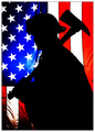
I read through the comments and have to say I quite like the lighting the way you have it. I think this one serves as an excellent portrait - the silhouette entry more of a universal shot.
What are the odds that I would be assigned both this image and your silhouette entry to critique? It is really amazing how much lighting can change the mood of an image. You received a considerable number of comments on this image regarding the lightings and I have to agree with most of them. The how and where to change the lighting I'm not technically competent enough to give you advise on but I encourage you to post this to the forums and ask for lighting suggestions.
One aspect I think was missed by those who commented is the lack of sharpness in the fireman's eyes. His expression for this image is exceptional but the lack of sharpness kept me from locking in on his eyes and making the emotional attachment that this image demands. You have an image here that could be exceptional with a few technical changes. I hope you have the time and interest to re-shoot this image sometime in the future.
Nice photo. I think your light could have been a lot better. You are lighting up at him so the shadow from his nove is almost going up into his eye. This kind of light can sometimes highlight undesirable facial characteristics like bags under the eye. You light should almost always be eye level with your subject of above eye leve. It will give you a nicer lighting pattern. Plus if you really learn how to use light to your advantage you can minimumize this that people don't like about themselves.
Emotive and powerful image presented here.
A bit too much texture/detail lost in his skin in my opinion, possibly a touch high on the neat image? but a fine image regardless - well done!
Very different from your silhouette entry, but every bit as potent with message and emotion. I'm sure both will finish near the very top, excellent photos!
What a sexy Fire Guy ;-)
The composition is a little cliched for my tastes, but I get what you are going for....I am not American, perhaps that is why it doesn't speak to me soo much..
I really like how you composed this shot. The colors are fabulous too as that they pop off the page. I find it interesting and compelling on the position of the flag - you have the strips facing down and whether it was intentional or not it does make one reflect on the 'fallen' towers and the fallen. The ones who died and the ones who laid down their lives - the fallen heroes. The fireman in the foreground makes us think of those who gave of themselves on the fateful day of 9/11 - and it doesn't have to be JUST that day but every day these public servants go out there 'to protect and to save lives'. This photo makes the viewer reflect on their contribution to the Nation. Now, I do have a critique and it is with regards to lighting. I think that you needed to cast more light on the helmet and fireman for he is a bit too much in shadow. Yes, one could say compositionally that plays well into the mood - he is in the shadow because of a pervading sadness with regards to fallen comrades. BUT with less shadows falling on his helmet and left shoulder, the fireman would be much more prominent and have an even greater impact on the photo composition because his uniform will be more visible (especially the crest on the front of the helmet which now rests in shadow and is barely visible).
The lighting is great here. Very moody and dramatic. I would have toned down the brightness of the helpmet just a bit. I realize it is a major element in the image, but it really competes with his face. His expression is what really tells the story.





![[ R E F L E C T ]](https://images.dpchallenge.com/images_challenge/0-999/536/1200/Copyrighted_Image_Reuse_Prohibited_387738.jpg)
 Add photograph to your favorites
 Add photographer to your favorites

 Photographer found comment helpful.


