| Author | Thread |
|
|
08/31/2006 08:28:42 PM |
Greets from the Critique Club
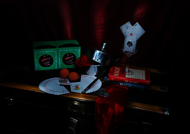
I've was lucky enough to recieve this image to critique. First off, it's nice to see what goes on "behind the scenes" for magic. And this was a good attempt at painting with light. However, it really doesn't work here.
The lighting for this is too dark. If you would have put a softened spotlight over the certain props and had the rest of the scene diffused, I think it would have worked much better. Also, this seems staged. Perhaps if you would have had things placed "randomly" on the trunk, that would have helped.
When painting with light, you have to be especially careful with glass and metal objects, because the reflections tend to get really bright. As you can see in this entry, the glass and metal pan have quite a bit of glare. Also, as mentioned, the light on the trunk really doesn't add anything, it actually takes away, because it seems too random and not focused on anything.
I hope this helps.
If you have any questions, comments, concerns about the critique, please feel free to PM me. Also, if it is helpful, please be sure to check the "This was helpful" box.
--Mike |
|
Comments Made During the Challenge  |
|
|
08/26/2006 01:54:19 PM |
|
 Photographer found comment helpful. Photographer found comment helpful. |
|
|
08/25/2006 09:07:08 AM |
|
This is too dark for me, its hard to see any details. |
|
| Photographer found comment helpful. |
|
|
08/23/2006 11:47:59 PM |
|
I assume you wanted it that dim, but in my opinion, that detracts from the photo. It's an interesting arrangement, though, with some depth, which is better than just laying it all out flat. 4. |
|
| Photographer found comment helpful. |
|
|
08/23/2006 04:30:59 PM |
|
| Photographer found comment helpful. |
|
|
08/23/2006 04:05:06 PM |
|
I'm never too fond of centered pictures of "stuff" with a simple background. This one is a bit dark as well. 4 |
|
| Photographer found comment helpful. |
|
|
08/22/2006 10:23:13 PM |
|
I like the mood, the setup, the composition. I don't like that there are a couple of highlights on the front edge of the furniture. Those highlights are ON nothing in particular, they would have been much better if they were hitting some mystery object to draw attention to IT, instead. 6 |
|
| Photographer found comment helpful. |
|
|
08/22/2006 03:54:53 AM |
|
| Photographer found comment helpful. |
|
|
08/21/2006 01:31:48 PM |
|
lighting needs work on this picture |
|
| Photographer found comment helpful. |
|
|
08/21/2006 10:51:02 AM |
|
| Photographer found comment helpful. |
Home -
Challenges -
Community -
League -
Photos -
Cameras -
Lenses -
Learn -
Help -
Terms of Use -
Privacy -
Top ^
DPChallenge, and website content and design, Copyright © 2001-2026 Challenging Technologies, LLC.
All digital photo copyrights belong to the photographers and may not be used without permission.
Current Server Time: 06/27/2026 07:16:55 PM EDT.