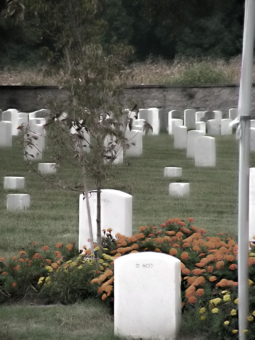
I wanted to capture an image that represented both death and life. Shot with natural light. The blurring and the lower saturation in post processing contribute to my idea of how we don't always see death and life as they truly are.
edit: I did indeed try a crop without the pole. It made sense to me to leave the flagpole out of the final image but I just could not bring myself to do it. I think it was because I am very familiar with this place, and I took it at such an odd angle that I very rarely (if ever) see it from. And the flagpole served as a point of reference for me visually. I am not regretting my decision, but the comments you all have made have helped me to 1) realize and remember exactly why cropping would have been better and 2) understand that in the future it would help to at least keep in mind that I might need to emotionally distance myself from the shot. Thanks for the comments.
Statistics
Place: 599 out of 684 Avg (all users): 4.8143 Avg (commenters): 4.7273 Avg (participants): 4.6952 Avg (non-participants): 5.2600 Views since voting: 753 Views during voting: 302 Votes: 237 Comments: 13 Favorites: 0
Interesting, kistover. I have read your after Challenge remarks. They remind me of a problem that I encounter in my own photography at times. It's hard for me to remember that the viewer is only going to see that portion of a scene that I show him. I can know the entire scene perfectly, and think that the part I show is the most important, etc... but if I don't include enough information to show why it is most important my viewer is going to be puzzled (and move on).
I hope the above ramble is of some use to you.
Alice
PS I really did like your image. My vote was one of your '7's.
I like everything about this picture except the pole on the right side...the reason is that it is on the same level, or even closer to the front, as the front headstone, but it's blurrier, and for me the power of this is (in part) how it seems to fade as you look towards the back of the picture. Otherwise, powerful.
This is a beautful commemorative shot, and the soft focus works well. Unfortunately (IMO, of course) that pole to the right is intrusive. A quick crop just to the left of it would make this a lovely image. Try it and see what you think...
The composition dosent capture my eye. The "texture" is litle strange (maybe to much or wrongly used noise reduction?). The colors dull and uninteresting in my opion. Think b&w would have been good here.
Lots of distracting elements in this pciture, the three, the pole on the right, the wall behind. I guess the smearing effect was deliberate (from the title), but I really don't see it adding anything. Clearing out the distractions and trying to get an interesting setting with all the gravestones might create something interesting.
This is a nice, emotive picture. The thing that lets it down for me is the pole over to the right. I think cropping out that distraction would make the gravestones stand out more.
I think I like the concept. two things though...the pole on the left and the entire image is blurred. I would like to have seen crispness on this photo.
The soft focus and slightly desaturated look work well here, but I would have preferred not to have had the treetop cropped and for the pole to the right to be cropped out as it serves no compositional purpose and distracts from what is otherwise a very nice shot.






 Add photograph to your favorites
 Add photographer to your favorites

 Photographer found comment helpful.


