| Author | Thread |
|
|
08/24/2006 07:20:50 AM |
Hello from the Critique Club.
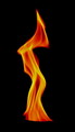
Well Leo, this is the second image of yours I've had the privilege of critiquing. I didn't vote in this challenge, so this is the first opportunity I've had to view your image. On a personal level I love it. The flow lines of the flame truly does remind me of the one and only time I saw the Northern Lights in person.
As for the Fire II challenge, by reading the comments left during the challenge, it is easy to see that those who took the time to study the photo caught your connection to the Northern Lights. However, for some, they did have to read the title to make that connection. As you are probably aware, if they have to read the title, then you probably won't score that well. Plus, your scored suffered from the lack of the infamous DPC wow factor.
On the technical side, the noise and blurriness of the flame effectively creates the feel of the Northern Lights. However, there is a little too much negative space in this image. If you intersect the flames with the right and left border of the image and remove about 2/3 of the dark area at the top, the red portion of the flame become a very strong focal point in the image. Interestingly enough, if you rotate the image 180 degrees with the suggested cropping and bump up the green saturation just a little, the remaining dark area takes on the look of pine trees and the flame really does look like the northern lights behind them. The trouble is, if you submitted an image with my suggestions for this challenge, the voters wouldn't have made the connection to Fire and your score would have suffered from the DNMC crowd.
You took a very simple everyday item and made an image with a lot of artistic potential. I think Imay borrow your idea and give it a try for myself if you don't mind.
Please feel free to PM me if you have any questions regarding this critique.
Tim
|
|
 Photographer found comment helpful. Photographer found comment helpful. |
Comments Made During the Challenge  |
|
|
08/20/2006 09:53:01 PM |
|
Mystical fire... I love it. |
|
| Photographer found comment helpful. |
|
|
08/20/2006 05:27:31 PM |
|
Simple and beautiful. I think this is a great entry. I'm not sure if you could've gotten the fire to look sharper and I'm not even sure that's needed. The softness is a great aspect in itself so its a tough call whether sharp would've made the image as appealing. I definitely love the colors and the simple arching shapes are wonderful. Very nicely envisioned and captured. I gave a 7 |
|
| Photographer found comment helpful. |
|
|
08/17/2006 06:59:09 PM |
|
Doesn't really get across the flames in a "wow" kind of way |
|
| Photographer found comment helpful. |
|
|
08/17/2006 01:10:49 PM |
|
Elegant, simple, beautiful. Your title pulled me into the image and made me better appreciate the composition. |
|
| Photographer found comment helpful. |
|
|
08/16/2006 11:17:44 PM |
|
A simple but compelling shot. |
|
| Photographer found comment helpful. |
|
|
08/16/2006 09:32:08 PM |
|
i think this is so cool. i love how it looks |
|
| Photographer found comment helpful. |
|
|
08/15/2006 06:03:39 PM |
|
Northern lights? Not bad, but I find I miss some anchor point... |
|
| Photographer found comment helpful. |
|
|
08/15/2006 07:18:53 AM |
|
nice colors could use some added contrast though. |
|
| Photographer found comment helpful. |
|
|
08/14/2006 10:50:22 PM |
|
I'm not digging on the dark line visible along the bottom edge. Tighten the crop a bit and punch up the colors, play with curves to get some dimension, and run it through some noise reduction software, and you might have a nice abstract. |
|
| Photographer found comment helpful. |
|
|
08/14/2006 08:47:46 PM |
I gave this a 5. Perhaps it has too much negative space at the top. I do like the idea and it does look like the northern lights. In the end I think perhaps there wasn't quite enough to it to hold our attention.
Keep it up though. |
|
| Photographer found comment helpful. |
|
|
08/14/2006 04:46:53 PM |
Nice shot! Cool flames but not so WOW. 5
Wazz |
|
| Photographer found comment helpful. |
Home -
Challenges -
Community -
League -
Photos -
Cameras -
Lenses -
Learn -
Help -
Terms of Use -
Privacy -
Top ^
DPChallenge, and website content and design, Copyright © 2001-2026 Challenging Technologies, LLC.
All digital photo copyrights belong to the photographers and may not be used without permission.
Current Server Time: 07/02/2026 07:10:28 AM EDT.