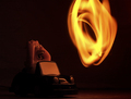
Adjust Contrast, removed reflections of my lights "very small". I liked the flame movement. I wanted to work more with a controled flame. Blured background to remove paper texture.
Statistics
Place: 58 out of 160 Avg (all users): 5.5873 Avg (commenters): 6.7692 Avg (participants): 5.4730 Avg (non-participants): 5.6609 Views since voting: 1298 Views during voting: 283 Votes: 189 Comments: 14 Favorites: 0
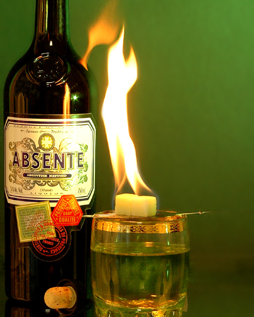
Greetings from the critique club. After viewing your photo I have a few things to mention. First the choice of subject and back ground combination work very well. Its a well thought out composition and setup. I wish it wasnt so tightly cropped on the left with so much negative space on the right. I would have liked to have seen the top of the bottle as well. The only other thing is the flash reflection on the bottle. Overall very well done, I would have scored this a 6 on initial look and depending on the rest I may have bumped it to a 7 later on. Nicely done and good luck with future challenges.
For me this has the WOW factor A. Because it is Absinthe B. What a perfect setup for a challenge C. Cuz I have never indulged and so desperately want to try.
The image: small blown out area in the label from the flame so what. But maybe a little more DoF and noise reduction. Awesome! 9
Something about the composition seems a bit off. Maybe with the flame in the location it is in, there is more attention drawn to it - but with the brightness of the flame I think anywhere it is positioned would have worked. I don't know what type of composition I would prefer.. it just seems off. If I could put my finger on it I might mark down for it but as it stands now I will not. There is haloing around the glass and bottle and while not immediately obvious, it is noticable.
I like the colors - no, I adore the colors. I also love how the flame seems to be coming from the glass as well as the bottle. The lighting is good too, and while some people might not prefer the flash reflection on the bottle I think it adds a nice touch.





 Add photograph to your favorites
 Add photographer to your favorites

 Photographer found comment helpful.


