| Author | Thread |
|
|
08/23/2006 07:40:22 AM |
46th place. 5.6. Grrrrrrrrrrrrr. This is so clean, crisp and well done. Sigh. Just goes to show how off the main wavelength of the masses I am. Very awesome photo for this challenge!
|
|
 Photographer found comment helpful. Photographer found comment helpful. |
Comments Made During the Challenge  |
|
|
08/22/2006 06:31:00 AM |
|
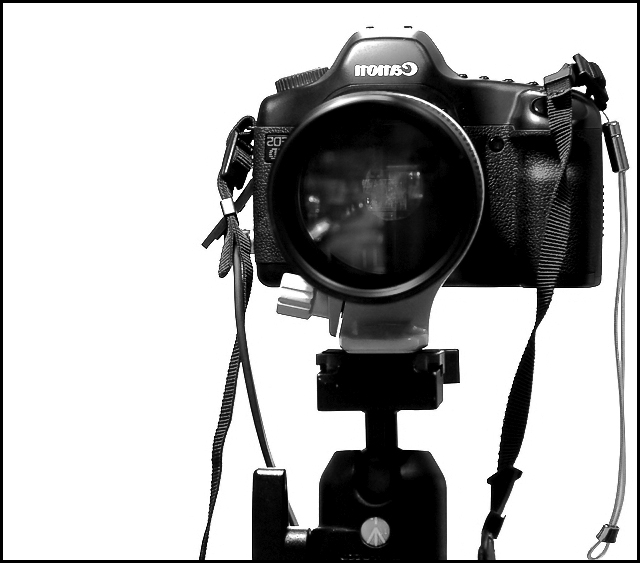
Nice shot, though I could wish the reflections in the lens - by far the most interesting part - were easier to see. If they were more of a feature, then I'd give this a higher mark. |
|
| Photographer found comment helpful. |
|
|
08/21/2006 09:18:11 AM |
|
Yes, I like this one..... |
|
| Photographer found comment helpful. |
|
|
08/19/2006 05:00:54 PM |
|
Great contrast. Should be #1 in my opinion |
|
| Photographer found comment helpful. |
|
|
08/17/2006 09:39:28 PM |
|
| Photographer found comment helpful. |
|
|
08/17/2006 07:56:32 PM |
|
|
|
08/16/2006 11:32:54 PM |
|
Very good composition. Nice contrast of camera and white background, without losing details on camera. |
|
| Photographer found comment helpful. |
|
|
08/16/2006 10:26:28 PM |
|
very simple but appealing!! the black and white is awesome and i like the softness of the reflection in the lense. nice work! 8 |
|
| Photographer found comment helpful. |
|
|
08/16/2006 11:18:34 AM |
|
I love this one! It's about as clean and crisp as you could possibly get. Ilove all the techie stuff showing just how much that camera knows about what it's doing :) Fantastic job! |
|
| Photographer found comment helpful. |
|
|
08/16/2006 05:59:15 AM |
Fair enough.
I think it would be a simple enough matter to flip the orientation in such a way that "nonac" becomes "Canon" and meets the viewers eyes correctly (Not to mention the 5D logo). Failure to do so strikes me as sheer lazyness and failure to properly pre-edit one's own images. I find the highlights in this image to be poorly controlled, and in particular right at the top of the camera where the flash shoe is located. I find the white background boring. I think the various straps detract from this image overall. I find the title to be silly, with no obvious relevance to the image itself.
On top of that, I detest receiving PMs while the challenge is ongoing. If people don't find my comment valuable, it should be a simple enough matter of NOT ticking the box. Those who think that PMing will NOT negatively affect their images' rating should think again. |
|
|
|
08/16/2006 05:32:34 AM |
|
focus sits on the body instead of the lens, contrast is much too high, crop at bottom too tight, overall unweighted |
|
|
|
08/16/2006 05:13:17 AM |
Nice and simple - I really like it.
I would have flipped it horizontally though (Legal in Basic). It doesn't need to shout "I'm a reflection!". |
|
| Photographer found comment helpful. |
|
|
08/16/2006 03:16:51 AM |
|
awesome clarity...only thing that spoils it is the reflection in the lens...looks like a person...lighting is amazing though |
|
| Photographer found comment helpful. |
|
|
08/16/2006 02:04:42 AM |
|
Nice high key b/w study. Good composition and spot on focus. I wonder what this might look like without the camera straps? Still a great shot for this challenge. |
|
| Photographer found comment helpful. |
|
|
08/16/2006 12:26:56 AM |
|
| Photographer found comment helpful. |
Home -
Challenges -
Community -
League -
Photos -
Cameras -
Lenses -
Learn -
Help -
Terms of Use -
Privacy -
Top ^
DPChallenge, and website content and design, Copyright © 2001-2026 Challenging Technologies, LLC.
All digital photo copyrights belong to the photographers and may not be used without permission.
Current Server Time: 06/29/2026 04:54:33 AM EDT.