| Author | Thread |
|
|
08/27/2006 08:36:45 PM |
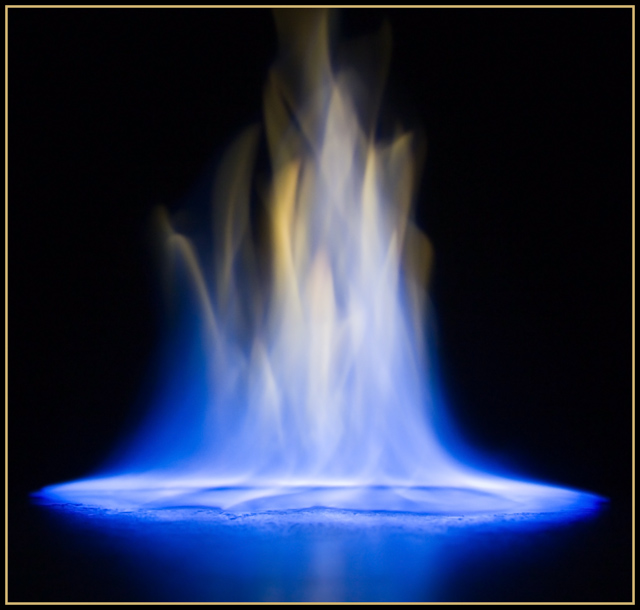
CRITIQUE CLUB COMMENT:
COMPOSITION
The composition of the image is ok though I typically don't like to see things dead centered as much as this. The reflection of the base along the bottom edge of the picture feels a little cut off. I'd have liked to see a bit more of the reflection.
IMAGE QUALITY
The image quality at the base of the flame and even the reflection are sharp and crisp which I like. Unfortunately, the flame looks a little fakey as if you had to have done a lot of post processing to create the effect. Whether or not you did a lot to the flame, the image comes off feeling a little forced to me and not natural.
CHOICE OF SUBJECT
My biggest complaint about the photo is not really being clear what I'm looking at. I'm not sure how much is natural "flame or fire" and how much is created in post processing.
CREATIVITY
The choice of using a blue hue in the picture was a great decision. Naturally the chellenge lends itself to lots of reds and oranges and your color selection sets it apart from others in the field. It's a gamble to have gone this way since for me it doesn't portray fire as much but I think it was gamble that paid off this time. The choice of the gold border seems to come with mixed reviews from the voters but I like it because you went with a gold looking border which really brings out the gold colors in the central focus of the picture.
SUMMARY
Overall, this is a very good shot certainly worthy of a top 20 finish but I'm not sure I see enough interesting for me to have pushed it into a top 5 contender. What would make the diference for me is to see something interesting actually on fire or something that made the flames more definable and less soft and blurry.
Message edited by author 2006-08-27 20:41:22. |
|
Comments Made During the Challenge  |
|
|
08/20/2006 06:38:37 PM |
|
|
|
08/20/2006 05:32:57 PM |
|
I love this. There's a very celestial feel to this for me. The colors are great and the composition is very nice. It looks like this was done on a mirror, so the reflection is inevitable but I think I'd like it even better if there were nothing but black at the base, so everything is growing upwards. I think the softish focus works here and the lighting is perfect. I don't know how the fire was controlled or if any special substance was used but I think it'd be cool (if its possible) to get some sort of graceful figure/figuring in the middle of the flames without it burning up. Added dimension and all that as this really gives me the impression of a sort of Venus rising. Anyway, great job! I gave a 7 |
|
 Photographer found comment helpful. Photographer found comment helpful. |
|
|
08/19/2006 01:11:40 AM |
|
Whoo! Awesome colors! I love the way this photo says both "hot" and "cool" at the same time. And great choice of border color as well. |
|
| Photographer found comment helpful. |
|
|
08/18/2006 06:57:30 PM |
|
|
|
08/18/2006 02:01:42 PM |
|
Love the blue tone and flames. Personal opinion though, I'd ditch the frame. |
|
|
|
08/17/2006 10:24:10 PM |
|
|
|
08/17/2006 04:57:30 PM |
|
|
|
08/17/2006 02:45:50 AM |
|
Now this... this is exquisite. Can't wait to see the techs after the challenge. Fav. |
|
|
|
08/16/2006 11:08:23 PM |
|
Like a dance of ghosts. Mesmerizing! |
|
|
|
08/16/2006 02:07:36 PM |
|
Not sure what this is but looks interesting |
|
|
|
08/15/2006 04:51:51 PM |
|
|
|
08/15/2006 09:44:24 AM |
|
oooo pretty! and different! 7 |
|
|
|
08/15/2006 06:49:36 AM |
|
nice use of border, and good composition and color as well. I prefer it werent cut off but I think then you'd lose the great composition you have.good luck. |
|
| Photographer found comment helpful. |
|
|
08/14/2006 10:06:59 PM |
|
Looks like an alien abduction...? Nice attempt at an abstract, good color, but would like to see a bit of crispness. |
|
| Photographer found comment helpful. |
|
|
08/14/2006 07:01:53 PM |
Cool flame! I wish you would have done some over saturating of it to bring out more color but that is just me. 6
Wazz |
|
|
|
08/14/2006 03:24:19 PM |
|
Nice. Love the color and clarity. |
|
|
|
08/14/2006 10:23:03 AM |
|
wow, nice ... except the border :-) 7 |
|
|
|
08/14/2006 02:10:50 AM |
|
Very, very beautiful image, bumping up to 8. |
|
Home -
Challenges -
Community -
League -
Photos -
Cameras -
Lenses -
Learn -
Help -
Terms of Use -
Privacy -
Top ^
DPChallenge, and website content and design, Copyright © 2001-2026 Challenging Technologies, LLC.
All digital photo copyrights belong to the photographers and may not be used without permission.
Current Server Time: 06/28/2026 07:17:50 PM EDT.