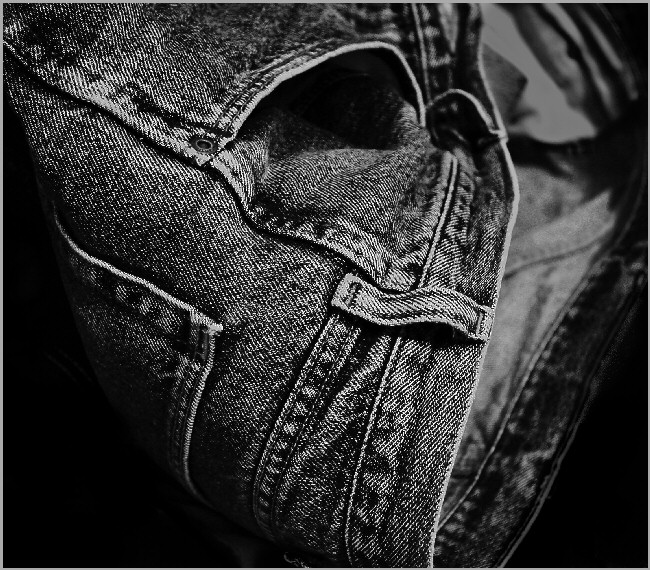
This one is kinda tough, first from a technical stand point, it does appear too dark, grainy and contrasty. I assume that is the look your going for so from a compositional standpoint I'm trying to understand why. First, I am really enjoying the dynamic diagonal lines that bring my eye back into the picture, as does the high contrast and the negative space to the LL and LR. The orientation is unusual too which I like but overall I'm having a hard time understanding the main point of the picture. I also feel that the softer, muted grays from the R side of the picture don't add much and in some ways may take away from the main point.
Sorry I can't be more help, this is just my opinion so take it for what it's worth.
Jack |







 Add photograph to your favorites
 Add photographer to your favorites

 Photographer found comment helpful.


