| Author | Thread |
Comments Made During the Challenge  |
|
|
08/01/2006 03:25:32 AM |
|
She looked scary and weird. |
|
|
|
07/29/2006 10:32:28 AM |
|
I'm not sure what to think of this one. |
|
|
|
07/28/2006 09:17:04 PM |
|
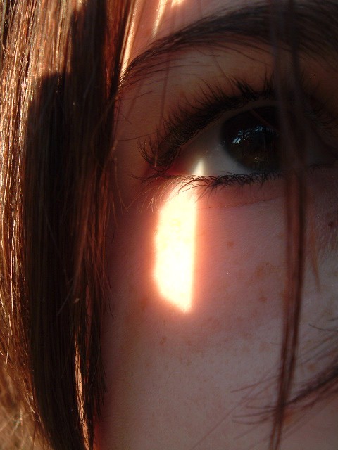
I would think that a lot of people are saying this. The patch of sunlight on her face is really distracting, so much so that I can hardly notice her eye. Someone gave me a comment once, saying that your eye is drawn to the brightest part of the photo. In this case that is definitely true. |
|
 Photographer found comment helpful. Photographer found comment helpful. |
|
|
07/27/2006 10:02:39 AM |
|
I would have really liked this photo if you could see the brown of the eye. |
|
| Photographer found comment helpful. |
|
|
07/27/2006 12:37:51 AM |
|
HIghlight on cheek is too bright, but I like the way you let the point of the triangle of light enter the eye. |
|
| Photographer found comment helpful. |
|
|
07/26/2006 10:46:41 PM |
|
| Photographer found comment helpful. |
|
|
07/26/2006 07:13:38 PM |
|
Personally I find the lighting distracting here. Other then that a very well done shot. |
|
| Photographer found comment helpful. |
|
|
07/26/2006 02:18:34 PM |
|
Just a bit too dark in the eye area really for my liking. |
|
| Photographer found comment helpful. |
|
|
07/26/2006 02:16:53 PM |
|
The colour of the eye is lost in the darkness. Pity. |
|
| Photographer found comment helpful. |
|
|
07/26/2006 09:04:17 AM |
|
I don't get the sense of background here. Just a close up of a face. The light below her eye is a tad too harsh for my taste. The eye is well focused and clear in the shot but I think that "hot spot" hurts it. |
|
| Photographer found comment helpful. |
Home -
Challenges -
Community -
League -
Photos -
Cameras -
Lenses -
Learn -
Help -
Terms of Use -
Privacy -
Top ^
DPChallenge, and website content and design, Copyright © 2001-2026 Challenging Technologies, LLC.
All digital photo copyrights belong to the photographers and may not be used without permission.
Current Server Time: 07/01/2026 02:29:07 AM EDT.