Author Thread Comments Made During the Challenge
Post actions
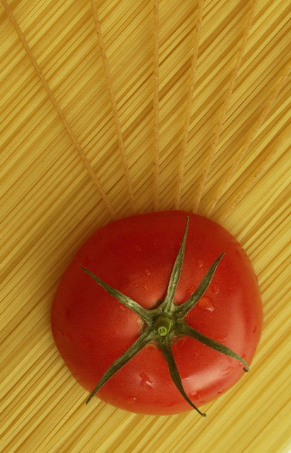
Because of its saturation, the tomato dominates the composition instead of lines. Nice idea. 7.
Post actions
this is well done. it looks like a magazine add. and it's creative. nice way to stick with the subject.
Post actions
Lotsa pasta in this challenge, I like this one a lot.
Post actions
Very good composition though the pic needs to be sharpened more for the glossy ribbon winning feel
Post actions
Post actions
WOuld like a little more saturation.
Post actions
Nice. I think there should be some work done here as far as levels/contrast/saturation go. The composition is great, but the colors are a bit flat. You can really vibe those up in PS!
Post actions
Love the composition but the color is washed out.





 Add photograph to your favorites
 Add photographer to your favorites


 Photographer found comment helpful.


