| Author | Thread |
Comments Made During the Challenge  |
|
|
07/23/2006 02:06:35 PM |
|
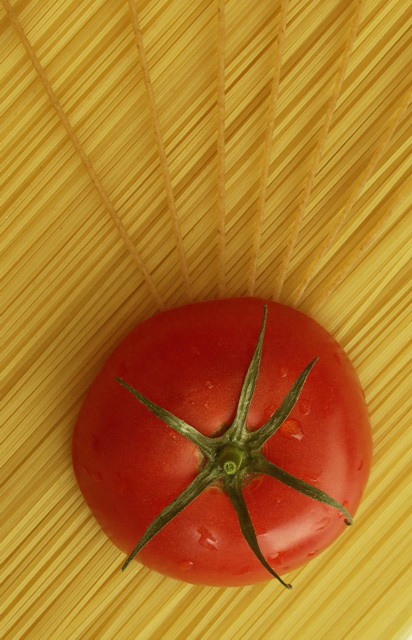
Because of its saturation, the tomato dominates the composition instead of lines. Nice idea. 7. |
|
 Photographer found comment helpful. Photographer found comment helpful. |
|
|
07/22/2006 05:37:45 PM |
|
this is well done. it looks like a magazine add. and it's creative. nice way to stick with the subject. |
|
| Photographer found comment helpful. |
|
|
07/22/2006 02:09:48 PM |
|
Lotsa pasta in this challenge, I like this one a lot. |
|
| Photographer found comment helpful. |
|
|
07/21/2006 11:35:23 AM |
|
Very good composition though the pic needs to be sharpened more for the glossy ribbon winning feel |
|
| Photographer found comment helpful. |
|
|
07/20/2006 01:38:43 PM |
|
| Photographer found comment helpful. |
|
|
07/20/2006 01:41:07 AM |
|
WOuld like a little more saturation. |
|
| Photographer found comment helpful. |
|
|
07/19/2006 05:56:22 PM |
|
Nice. I think there should be some work done here as far as levels/contrast/saturation go. The composition is great, but the colors are a bit flat. You can really vibe those up in PS! |
|
| Photographer found comment helpful. |
|
|
07/19/2006 12:55:57 PM |
|
Love the composition but the color is washed out. |
|
| Photographer found comment helpful. |
Home -
Challenges -
Community -
League -
Photos -
Cameras -
Lenses -
Learn -
Help -
Terms of Use -
Privacy -
Top ^
DPChallenge, and website content and design, Copyright © 2001-2026 Challenging Technologies, LLC.
All digital photo copyrights belong to the photographers and may not be used without permission.
Current Server Time: 06/29/2026 08:53:08 PM EDT.