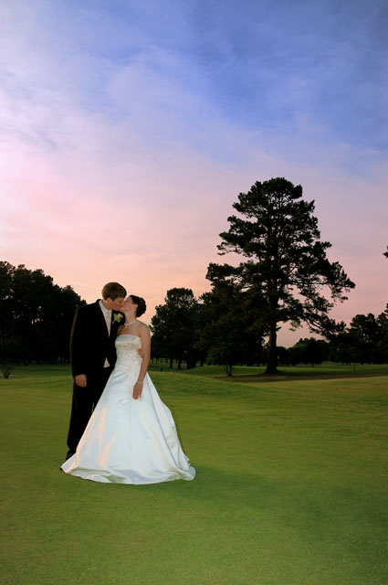
Very pretty shot. I, personally, would have liked it just a touch closer. However, as one comment below said - they know what they look like. Therefore, they probably get more out of the pulled back setting. They appear very relaxed and the technicals are good. I agree with perhaps toning down the green just a bit.
Beautiful colours! I would have cropped the branch out from the middle right hand edge of the frame but other than that I really like it and looks like you got the processing done pretty good :o)
I happen to like the color of the sky and of the B&G, but don't care for the color of the grass. It looks "artifically lightened" in post. Especially since the trees ae so dark as to be in silhouette, it makes one wonder why the grass is glowing. Even if it's not artificial, I think I'd probably burn it in to darken the grass a bit.
Same on the bit of tree on the right. Love the colors, but at first glance, I wanted the tree to be on the left with the couple on the right - just a gut reaction at first.
The bride and groom know what they look like, so I can see why they love the shot - don't need to see the faces as the landscape says it all. Perhaps including a second closeup from this image for their album would be an idea.
I like this alot, compositionally the 'kiss' is at just the right height above the trees. The colours are strong, this would stand out well in print and make a powerful image. If I had one tiny critism, I'd like the subject a little closer / larger in the image, to get slightly more detail in the faces. Oh and I'd have cloned out that tiny bit of tree floating on the right.




 Add photograph to your favorites
 Add photographer to your favorites


 Photographer found comment helpful.


