| Author | Thread |
|
|
07/30/2006 12:27:52 AM |
|
Very nice colors and forms. Congratulations on your top 20 finish. |
|
 Photographer found comment helpful. Photographer found comment helpful. |
|
|
07/29/2006 09:59:04 AM |
|
Greetings from the critique club. After looking over your photo I have some comments I'd like to share. First let me say that I love the colors of the photo. Great job of picking your subject and their colors. Nice choice of using natural lighting to light the subject. I like the angle at which you chose to shoot it at. I'm not too sure I like the crop of the photo would like to see a taller vertical crop, it may help the look or hurt, hard to say without seeing. Just an idea. I'd also like to see the foreground in the lower right a bit more in focus. It seems a bit soft. Add a little contrast and some saturation to help with the "pop" factor and I think you add more to your even impressive score. Nicely done overall fit the challenge very well. |
|
| Photographer found comment helpful. |
|
|
07/24/2006 09:00:58 PM |
|
Awesome job! Congratulations on your top 20! |
|
| Photographer found comment helpful. |
|
|
07/24/2006 12:50:49 AM |
|
Top 20 placement. Nice job Alecia! |
|
| Photographer found comment helpful. |
|
|
07/24/2006 12:10:13 AM |
Congrats on an excellent image. Great job!!!
|
|
| Photographer found comment helpful. |
Comments Made During the Challenge  |
|
|
07/23/2006 10:30:59 PM |
|
great rhythm in this image - though the hot spot in the lower right detracts from the impact. |
|
| Photographer found comment helpful. |
|
|
07/23/2006 02:21:18 AM |
|
I love the colors, but I especially love the lighting! |
|
| Photographer found comment helpful. |
|
|
07/22/2006 05:14:34 PM |
|
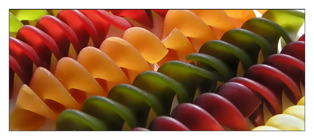
I've noticed that viewers tend to like spirals. This should be no different. At first, it looked like a non-macro image of some sliced fruit pieces or something . the discovery of the simplle well-lit beautifully colored subject is great. There are parts of the images that could be slight more crisp but overall very nice. 8 |
|
| Photographer found comment helpful. |
|
|
07/21/2006 09:38:09 PM |
|
This is such a great image. Love it. |
|
| Photographer found comment helpful. |
|
|
07/21/2006 09:12:37 PM |
|
Good thing I didn't decide to do this shot as this by far would have out gunned my image ;) This is great. The simplicity of the spirals along with the colors work well in creating a dynamic image. It's just quite unfortunate that it's cropped too small. But does that matter? Not really. Bumping up ;) |
|
| Photographer found comment helpful. |
|
|
07/20/2006 03:51:11 PM |
|
Wow beautiful picture, especially the top left, I wonder what lighting from the bottom would've look liked |
|
| Photographer found comment helpful. |
|
|
07/20/2006 02:02:24 PM |
|
Clean, simple...it works very well. Only distraction is the top right corner - wish that it was more continuous and you couldn't see the end of the pasta. Good luck in the challenge. |
|
| Photographer found comment helpful. |
|
|
07/19/2006 05:44:55 PM |
|
Setting pasta diagonally works very well and helps draw you into the photo. Nice work on the DOF as well. Made my top three!!! |
|
| Photographer found comment helpful. |
|
|
07/18/2006 05:20:43 PM |
|
I really like this photo, but I find the border a bit too wide because of your short vertical dimension. The border width is overwhelming the photo. DPC dimensions are so small to begin with, that it really puts a premium on the actual photo real estate. Viewed at a larger scale the border would be fine. The color, texture and composition are otherwise great. |
|
| Photographer found comment helpful. |
|
|
07/18/2006 08:22:07 AM |
|
Interesting lighting and subject. Good colours. |
|
| Photographer found comment helpful. |
|
|
07/17/2006 08:09:59 PM |
|
| Photographer found comment helpful. |
|
|
07/17/2006 12:56:04 AM |
|
wonderful colours and composition |
|
| Photographer found comment helpful. |
|
|
07/17/2006 12:31:44 AM |
|
| Photographer found comment helpful. |
|
|
07/17/2006 12:15:50 AM |
|
| Photographer found comment helpful. |
Home -
Challenges -
Community -
League -
Photos -
Cameras -
Lenses -
Learn -
Help -
Terms of Use -
Privacy -
Top ^
DPChallenge, and website content and design, Copyright © 2001-2026 Challenging Technologies, LLC.
All digital photo copyrights belong to the photographers and may not be used without permission.
Current Server Time: 06/27/2026 12:50:01 PM EDT.