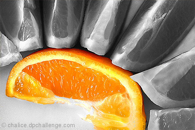
Trading POst - A nice image overall. Nice flow on the outer pieces (I think maybe a bit of color would have been nice). Maybe a slightly different crop to either bring in the whole colored piece or to crop it out the same on the other side and show more of the upper pieces. Not sure. Nice detail though and you did a good job editing with the selective desat. Clean work.
Trading post...
Nice addition to your front page! Great job on the selective desat. This works really well as an abstract. One thing that could have made this better IMO is if the colored piece of the orange was perfectly cut.
At first glance, I didn't realize the outer segments were orange sections as well. The desaturation is well done, though I almost think I'd like to see the outer segments partially desaturated - maybe from where they touch the single orange segment have them desaturated as you go out toward the edge of the picture, as though the single segment is sucking the color from the others. I thought it worked well as an abstract.
I scored this 5. Part of that score was the selective desaturation, which is a bit "on the nose" for me in this particular picture. Other than that, I like the setup, and the tension created by the arcing orange lifting into the other segments. A nice abstract example.
oversharpened, not very abstract, the main subject is has its edge cropped off. also the desaturated areas lack contrast and considering it is a heavy handed use of photoshop, the desat doesn't do much for the image. 2






 Add photograph to your favorites
 Add photographer to your favorites

 Photographer found comment helpful.


