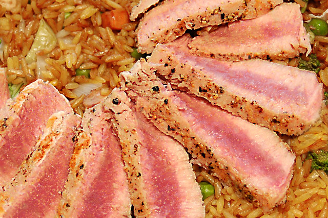
Abstract... Using colors, shapes, lines to created a mood or reaction. I was going for a pleasing semi circle with bolds reds of the Tuna standing out against the muted colors of the rice.
Editing: PS (Layer Masks for Levels, Hue Saturation, cloning to touch up my bad cuts on the fish and stray rice, USM, ?NI?)
Statistics
Place: 182 out of 199 Avg (all users): 4.4760 Avg (commenters): 4.5000 Avg (participants): 4.1566 Avg (non-participants): 4.6880 Views since voting: 884 Views during voting: 298 Votes: 208 Comments: 8 Favorites: 0
I think the main lesson here is the fact that real food rarely photographs well. Most of the food art you see in ads and on menus are not real food. Never trust an Ice Cream ad!
IMO there are many things that contributed to the low score.
1. The fish is not in focus or just is not sharp
2. It's not very abstract, this looks just like tuna on rice and some peas, and that is exactly what it is. In your notes you mention bold reds and muted colors of the rice. The reds are not bold and the rice is not muted.
3. This probably wouldn't score well in a Food challenge either. Not enough contrast, rice looks too oily, tuna looks dirty.
I've seen your work before, very strong. I am sure I am not telling you anything you don't already know.
I hope this was helpful. Feel free to contact me if you have any questions.
This is very harsh on the eyes. There is a lot going on here, but I am not sure I can pinpoint the problem. Too much is fighting for the attention of the viewer.





 Add photograph to your favorites
 Add photographer to your favorites

 Photographer found comment helpful.


