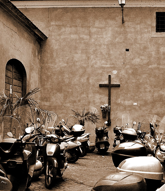
I like the idea here, the distracting elements for me though are the half a window and two-thirds of a lamp near the top right. It bugs me when things get chopped off like that. I think the picture looks a lot better if it's cropped in a line below the guttering.
I really like this picture for it's irony. I don't think it'll do well tho. Not certain people will get it. I also like the color tone of the image. Good luck.
The sepia color tone is a nice choice. Great subject, but the light and window at the top are distracting and don't add to the subject. I think cropping the photo into a square would be an interesting improvement. Also, it seems a bit crooked. Overall, 8.
provocative with the title; but cute without.
I like the composition, good work.
by the way, this piece here reminds me of the works by JJBeguin (that's a compliment)





 Add photograph to your favorites
 Add photographer to your favorites


 Photographer found comment helpful.


