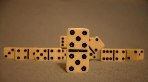
I think this shot has a whole lot of potential. The focus is a bit soft, but I like the composition. Especially that dominoe that's tilted like its peeking behind the double fives. I think what hurts this image the most is the coloring. The dominoes (IMO) should be a brilliant white, as should the background and whatever its set upon. To me, the tone it has now makes it seem like the incorrect white balance was chosen while photographed under incandescent light so it has that sort of tannish/yellowy tone instead of a crisp white. You've also created a horizon with your placement of the dominoes and it looks a bit tilted. Finally there is a bit of artifacting around the edges of all of the pieces which could either be compression issues (mostly unavoidable) or from too much USM. I think though the biggest issue is the tone. I realize that its possible that is the actual color of the tiles and the area you took the picture in, but if not, and it is a White Balance issue, I'd suggest redoing it with the correct setting and see if it has more pop and brightness to it. I gave a 4.
cool idea, though it seems that your white balance might be off, I like that your background is such a soft even color and I like how the edges are soft as well







 Add photograph to your favorites
 Add photographer to your favorites


 Photographer found comment helpful.


