| Author | Thread |
Comments Made During the Challenge  |
|
|
09/07/2003 02:54:25 PM |
|
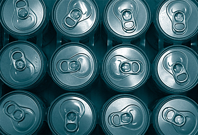
very nice idea. you might have bought some more sodas and increased the number of cans which might have made it an even more powerful shot. i also wonder how it would have looked in black and white (or a silver monotone) |
|
 Photographer found comment helpful. Photographer found comment helpful. |
|
|
09/06/2003 12:33:21 AM |
|
good idea! I wish all the tabs were going in the same direction. still a nice job 6 |
|
| Photographer found comment helpful. |
|
|
09/02/2003 10:10:57 PM |
|
I like this, and the metal-blue duotone suits it. would be better without the plastic connectors, with a neater crop along the edges of the cans (no circles cut off) and with the tabs pointing in a pattern or all the same way. |
|
| Photographer found comment helpful. |
|
|
09/01/2003 12:59:12 AM |
|
Makes me thirsty. I would have all the tabs in the same direction. I think the blue cast in the picture is distracting. |
|
| Photographer found comment helpful. |
Home -
Challenges -
Community -
League -
Photos -
Cameras -
Lenses -
Learn -
Help -
Terms of Use -
Privacy -
Top ^
DPChallenge, and website content and design, Copyright © 2001-2026 Challenging Technologies, LLC.
All digital photo copyrights belong to the photographers and may not be used without permission.
Current Server Time: 06/28/2026 04:20:00 PM EDT.