| Author | Thread |
|
|
07/17/2006 10:23:03 PM |
|
Very nice concept. Congratulations on your top 20 finish. |
|
 Photographer found comment helpful. Photographer found comment helpful. |
|
|
07/17/2006 05:35:09 AM |
* Greetings from critique club *
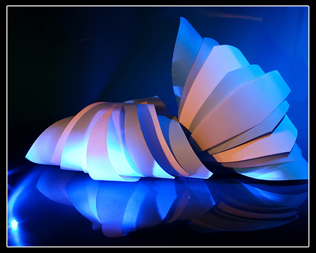
Hi, I like this photo. A well deserved rating and final position in the contest. very good the idea and the tones are great. even the composition is very good. I think that there is only a small problem in this image i.e. the small over exposition in the left lower side. I think that was impossible for you remove it for two reasons, the first is that you are in basic editing and the second because if you crop the image you loss the reflected curve and the space around the first croissant.
The crop on second croissant I think is a very minor problem because the image is build above all with the first croissant and his reflection.
Best regards
Gennaro |
|
| Photographer found comment helpful. |
|
|
07/12/2006 08:27:47 AM |
|
Tx all for your nice comments! |
|
Comments Made During the Challenge  |
|
|
07/11/2006 05:34:17 PM |
|
| Photographer found comment helpful. |
|
|
07/11/2006 06:50:10 AM |
|
Wonderful composition and color. The design and display are very pleasing... but not stationery. |
|
| Photographer found comment helpful. |
|
|
07/10/2006 12:27:30 PM |
|
| Photographer found comment helpful. |
|
|
07/10/2006 07:56:45 AM |
|
This must also be a ribbon contender. Excellent. |
|
| Photographer found comment helpful. |
|
|
07/10/2006 07:45:39 AM |
|
| Photographer found comment helpful. |
|
|
07/09/2006 07:51:01 PM |
|
clever! i especially like the lighting |
|
| Photographer found comment helpful. |
|
|
07/09/2006 07:30:46 PM |
|
| Photographer found comment helpful. |
|
|
07/07/2006 09:17:06 AM |
|
Great lighting and pattern. The cropping on the right and the glare on the left are the only things keeping this from being in contention. |
|
| Photographer found comment helpful. |
|
|
07/06/2006 08:25:10 PM |
|
I like the blues in this. Stronger contrast would improve this a bit. |
|
| Photographer found comment helpful. |
|
|
07/06/2006 07:34:15 AM |
|
Great lighting on this, not so sure about the highlights... it reminds me of a late night at the office |
|
| Photographer found comment helpful. |
|
|
07/06/2006 06:55:19 AM |
|
Oh this looks like the opera house! |
|
| Photographer found comment helpful. |
|
|
07/06/2006 03:45:22 AM |
|
Excellent, creative, great lighting. |
|
| Photographer found comment helpful. |
|
|
07/05/2006 11:08:58 PM |
|
Interesting idea. Nice muted colors and reflection. I dont much care for the glare on the left corner and the cropping out of the edge of the right croissant. But a good job overall. |
|
| Photographer found comment helpful. |
|
|
07/05/2006 11:04:00 PM |
|
My favorite so far! Beautiful lighting! Very creative composition. I'm sure this will do very well. Great job!!! |
|
| Photographer found comment helpful. |
|
|
07/05/2006 05:28:39 PM |
|
| Photographer found comment helpful. |
|
|
07/05/2006 10:46:49 AM |
|
Fantastic lighting, and nice composition |
|
| Photographer found comment helpful. |
|
|
07/05/2006 09:25:56 AM |
|
great title...nice lighting and shot |
|
| Photographer found comment helpful. |
|
|
07/05/2006 07:30:39 AM |
|
| Photographer found comment helpful. |
|
|
07/05/2006 05:10:23 AM |
Croissants, yes. But my initial impression was of the Sydney Opera House...
Great lighting, and I love the use of reflection. I wouldn't have cropped the right hand edge off, though. |
|
| Photographer found comment helpful. |
|
|
07/05/2006 01:01:50 AM |
|
honestly, i like everything but the border. it seems to "date" the photo. very cool idea and execution!! |
|
| Photographer found comment helpful. |
Home -
Challenges -
Community -
League -
Photos -
Cameras -
Lenses -
Learn -
Help -
Terms of Use -
Privacy -
Top ^
DPChallenge, and website content and design, Copyright © 2001-2026 Challenging Technologies, LLC.
All digital photo copyrights belong to the photographers and may not be used without permission.
Current Server Time: 06/30/2026 04:32:11 PM EDT.