|
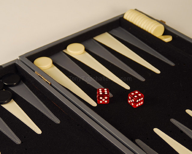
Nice contrasting colors and simple composition. I wish the lighting were a little brighter. The tones - though the red does stand out - seem very muted and sort of drab. I wish it was a nice sharp black/white to help make that red pop out even more. Focus is decent but seems sharpest on the board where the black token thingies are rather than on the dice where I'd expect it. There is also a slight yellow haze to the image in the main portion of the image which might be due to lighting issues. Still I like the image, I think its fun and it works well for the challenge. 5. |





 Add photograph to your favorites
 Add photographer to your favorites


 Photographer found comment helpful.


