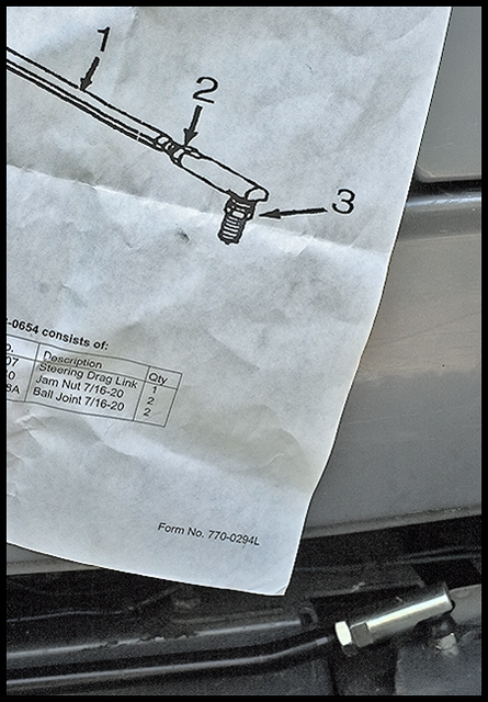
risky one here. The use of words/letters draws my eye to them (just the stuff on the bottom of the page) and I'm left struggling between reading and taking in the frame. I'm all around the frame - if I image the frame with the writing blurred or in characters I can't interpret, I get more of a sense of lines and angles with lots of gray. Feel the flat lighting was the way to go but it doesn't add any interest.
I like how you included the actual component with the schematic. The lighting is a little flat and I would have liked to have seen the paper a little whiter.





 Add photograph to your favorites
 Add photographer to your favorites


