| Author | Thread |
Comments Made During the Challenge  |
|
|
09/07/2003 08:12:18 AM |
|
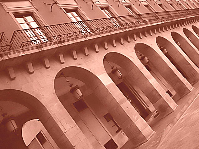
I wouldn't have made the perspective from this odd angle. I'd have done it straight, or went right for the corner to corner. To each his own though. The colors are pretty bland. I bet a sunnier day would've helped you out. Not bad, but it needs something. |
|
|
|
09/05/2003 05:38:44 PM |
|
YAY! strong angles are good! |
|
 Photographer found comment helpful. Photographer found comment helpful. |
|
|
09/05/2003 02:08:15 AM |
|
This would look better with a more brownish tone, the red tone is very distracting. |
|
| Photographer found comment helpful. |
|
|
09/03/2003 08:30:08 PM |
|
Very creative but too red for me. |
|
| Photographer found comment helpful. |
|
|
09/03/2003 04:34:12 PM |
|
Nice image, great composition. Fits the theme well. It works for me. 8 Morgan |
|
| Photographer found comment helpful. |
|
|
09/03/2003 11:50:48 AM |
|
I don't like the colour, or the angle. I think a level shot would have been a much stronger image. |
|
|
|
09/02/2003 09:58:11 PM |
|
| Photographer found comment helpful. |
|
|
09/02/2003 12:42:41 AM |
|
I thought about this same perspecitive, only using a fence and making the bottom verticle. Yours is much better. :) A little too much red in the toning I think however. |
|
| Photographer found comment helpful. |
|
|
09/01/2003 01:31:02 AM |
|
Too bad it's tilted like this. I know you probably intended it this way, but it would have been interesting by itself without the tilt. Also, you could adjust the contrast of the image - the shadow areas are a bit washed out. |
|
| Photographer found comment helpful. |
Home -
Challenges -
Community -
League -
Photos -
Cameras -
Lenses -
Learn -
Help -
Terms of Use -
Privacy -
Top ^
DPChallenge, and website content and design, Copyright © 2001-2026 Challenging Technologies, LLC.
All digital photo copyrights belong to the photographers and may not be used without permission.
Current Server Time: 07/08/2026 05:58:50 PM EDT.