| Author | Thread |
|
|
07/02/2006 07:52:54 AM |
|
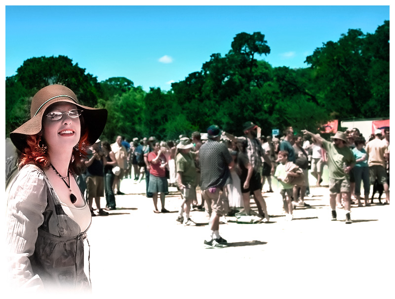
Another very interesting example of funky colors that work well. I am trying to figure out if a slightly tighhter crop on the right would have helped this as it feels just a bit long (athough I like the guy pointing - he is a good background subject IMO). The detal and color choices on your main subject is great but I dont much care for the blended white corner. |
|
 Photographer found comment helpful. Photographer found comment helpful. |
|
|
07/02/2006 07:31:03 AM |
|
like the way she stands out from the background and the smudging in the corner, interesting effect |
|
| Photographer found comment helpful. |
|
|
07/02/2006 04:46:17 AM |
|
I love the way that you've go the main subject to stand out from the background and I feel that the airbrushing is very well done - it blends with the ground seamlessly. To me, the colour of the sky is a little off and the reflections in the spectacles is a little distracting. Another thing I've just noticed is that the outline of the tree on the left seems to mimic the curve of the top of her hat, adding a framing element. |
|
| Photographer found comment helpful. |
|
|
07/01/2006 10:58:47 PM |
|
Yes....dreamy sort of feel to this image. I'll second the saturation in the background, just to pull it back a bit. Keep experimenting, your getting some good results! |
|
| Photographer found comment helpful. |
|
|
07/01/2006 10:31:32 PM |
Very nice. I like the nice crisp feel here. I do agree with srdanz that the background could be desaturated some but I don't think it needs any more blurring. Your eyes already go straight to the subject. Personlly, I don't like the white airbrushing. If you are going to use it, it should be on all four corners instead of just the one. The subject already takes up such a small portion of the frame that I wouldn't want to lose any more. Overall a nice active shot with lots going on for the viewer to explore.
edit: Just remembered to add, here the subject is looking into the frame which makes all that space much more cohesive. This in contrast to the cowgirl. Just imagine here if the subject was looking off to the left, it would make all that space seem unncessary.
Message edited by author 2006-07-01 23:00:53. |
|
| Photographer found comment helpful. |
|
|
06/30/2006 04:37:43 PM |
|
Like the idea about the white frame and airbrushing the bottom corners, but the remainder of the frame should be blurred some more (and/or desaturated) for better effect. I understand that this is an experiment only. |
|
| Photographer found comment helpful. |
Home -
Challenges -
Community -
League -
Photos -
Cameras -
Lenses -
Learn -
Help -
Terms of Use -
Privacy -
Top ^
DPChallenge, and website content and design, Copyright © 2001-2026 Challenging Technologies, LLC.
All digital photo copyrights belong to the photographers and may not be used without permission.
Current Server Time: 06/02/2026 03:41:36 PM EDT.