| Author | Thread |
|
|
05/15/2007 06:21:09 PM |
|
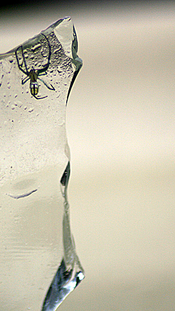
Contrary to some others (comments shown below) ... I think this is very well composed. I lke the negative space and the desolate feeling. |
|
 Photographer found comment helpful. Photographer found comment helpful. |
Comments Made During the Challenge  |
|
|
07/04/2006 10:13:47 AM |
|
Wish this shot had higher image quality, sharper and clearer, any way to make it so, like with a lower iso, faster shutterspeed or something like that? Would improve it heaps anyway :) |
|
| Photographer found comment helpful. |
|
|
07/04/2006 01:39:43 AM |
|
| Photographer found comment helpful. |
|
|
07/02/2006 10:59:13 AM |
|
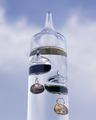
The glass seems a little out of focus. A sharper edge (no pun intended :)) would have made this a better shot for me. |
|
| Photographer found comment helpful. |
|
|
07/02/2006 09:03:04 AM |
|
| Photographer found comment helpful. |
|
|
07/01/2006 09:49:10 AM |
|
Nice. Not a speciall photo, but the moment was hard |
|
| Photographer found comment helpful. |
|
|
06/30/2006 09:37:45 PM |
|
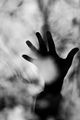
He looks kinda dead. I'm sort of ambivalent about the empty space to the right - not sure if it needs more or less. |
|
| Photographer found comment helpful. |
|
|
06/30/2006 09:06:45 AM |
|
It's a little soft, but nice idea |
|
| Photographer found comment helpful. |
|
|
06/30/2006 07:58:37 AM |
|
I can't help feeling that the edge would have been better off further to the right, so as to not split the pic in half. |
|
| Photographer found comment helpful. |
|
|
06/30/2006 03:15:07 AM |
|
Nice execution, but little interest |
|
| Photographer found comment helpful. |
|
|
06/29/2006 11:09:14 PM |
|
The reflection of the bottom edge of the glass distracts from the interest at the top. A different background (blue?) would help the spider and glass to stand out more. Nice idea. |
|
| Photographer found comment helpful. |
|
|
06/29/2006 09:34:42 PM |
|
Great idea. Wish the spider was more in focus though. |
|
| Photographer found comment helpful. |
|
|
06/29/2006 05:19:27 PM |
|
| Photographer found comment helpful. |
|
|
06/29/2006 10:00:57 AM |
|
seems a tad soft. interesting idea though |
|
| Photographer found comment helpful. |
|
|
06/28/2006 11:14:48 PM |
|
There's quite a lot of negative space on the right. Also the glass on the bottom is out of focus and I think that the image could be made square, with that part cropped out. |
|
| Photographer found comment helpful. |
|
|
06/28/2006 08:22:50 AM |
|
a little bit grainy looking but i still like the picture |
|
| Photographer found comment helpful. |
Home -
Challenges -
Community -
League -
Photos -
Cameras -
Lenses -
Learn -
Help -
Terms of Use -
Privacy -
Top ^
DPChallenge, and website content and design, Copyright © 2001-2026 Challenging Technologies, LLC.
All digital photo copyrights belong to the photographers and may not be used without permission.
Current Server Time: 06/28/2026 11:12:51 AM EDT.