| Author | Thread |
Comments Made During the Challenge  |
|
|
07/04/2006 11:51:37 PM |
|
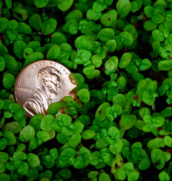
Splendid idea. Just wish the penny was a little sharper. |
|
 Photographer found comment helpful. Photographer found comment helpful. |
|
|
07/04/2006 12:50:38 PM |
Technical: Focus - 0 seem a bit soft to me
Exposure- 1
Quality - 1
Aesthetic: Comp. - 1
Light - 1
Color - 1
Wow factor: 0
Personal tilt: 2/3
What I like: I like the nice clean penny and the green texture around it works well.
What I didn't like: Focus seems a tat soft to me. The light on the penny is a little harsh. |
|
| Photographer found comment helpful. |
|
|
07/04/2006 07:18:55 AM |
|
| Photographer found comment helpful. |
|
|
07/04/2006 04:19:16 AM |
|
luv the photo composition and lighting |
|
| Photographer found comment helpful. |
|
|
07/04/2006 03:35:16 AM |
|
This is a visually appealing depiction of the theme you've chosen. Nicely done. |
|
| Photographer found comment helpful. |
|
|
07/02/2006 03:04:05 PM |
|
The lighting seems a bit too harsh here, it robs the coin of it's interesting details. I like the placement of the coin though. |
|
| Photographer found comment helpful. |
|
|
07/02/2006 02:30:00 AM |
|
Good work and clarity on the coin. |
|
| Photographer found comment helpful. |
|
|
07/01/2006 09:14:59 AM |
|
| Photographer found comment helpful. |
|
|
06/30/2006 05:49:30 PM |
|
Nice photo. The greenery is a nice deep green. Composition wise I would prefer the penny moved up a bit or have a little cropped off the top. It also looks like the penny is a bit blown out in the bright spots which doesn't work for this shot. |
|
| Photographer found comment helpful. |
|
|
06/30/2006 02:50:26 PM |
|
Nice idea overall, but I think a little deeper DOF to get the greenery in a bit more focus would help. Who knows, though, maybe that would be lame. |
|
| Photographer found comment helpful. |
|
|
06/30/2006 02:24:24 PM |
|
| Photographer found comment helpful. |
|
|
06/29/2006 09:14:44 PM |
|
I like the colors. It looks a little blurry on the bottom and sides though. |
|
| Photographer found comment helpful. |
|
|
06/29/2006 07:09:34 PM |
|
the gren is too out of focus in my opionion... and the copper with the green doesn't make the best color combo |
|
| Photographer found comment helpful. |
|
|
06/29/2006 06:44:38 PM |
This is a pretty picture.
But it's grainy and a bit out of focus.
Too bad.. |
|
| Photographer found comment helpful. |
|
|
06/29/2006 07:06:57 AM |
|
Nice shot...if the peeny was in a bead of clover you couls have killed to birds with one stone...lol |
|
| Photographer found comment helpful. |
|
|
06/29/2006 02:13:20 AM |
|
I must say best one of these Ive seen so far |
|
| Photographer found comment helpful. |
|
|
06/28/2006 11:35:30 PM |
|
| Photographer found comment helpful. |
|
|
06/28/2006 10:10:12 PM |
|
Nice idea, and the penny looks good. I think you could have selected a better background for it, or got the leaves in better focus. |
|
| Photographer found comment helpful. |
|
|
06/28/2006 08:44:06 PM |
|
Nicely done on the focus and I like the choice of where to place it. It doesn't possess a ton of "wow", but still a worthy effort. 6 |
|
| Photographer found comment helpful. |
|
|
06/28/2006 06:28:42 PM |
|
nice lighting on the penny. |
|
| Photographer found comment helpful. |
|
|
06/28/2006 05:56:03 PM |
|
Nice compo but maybe a bit too rough. 6 |
|
| Photographer found comment helpful. |
|
|
06/28/2006 02:56:11 PM |
|
Nicely done. borders are usually questionable but i think this one would have been helped by a border. |
|
| Photographer found comment helpful. |
|
|
06/28/2006 12:20:40 PM |
|
Cute concept, to much light on the coin, but the rest balances nicely. |
|
| Photographer found comment helpful. |
Home -
Challenges -
Community -
League -
Photos -
Cameras -
Lenses -
Learn -
Help -
Terms of Use -
Privacy -
Top ^
DPChallenge, and website content and design, Copyright © 2001-2026 Challenging Technologies, LLC.
All digital photo copyrights belong to the photographers and may not be used without permission.
Current Server Time: 06/28/2026 06:27:20 AM EDT.