Author Thread
07/11/2006 08:11:46 PMPost actions
Greetings from the CC.
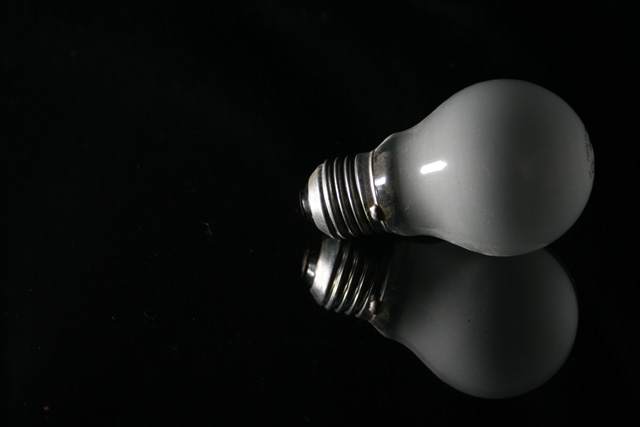
I like your image while not shouting wow it is clean, simple, clear and to the point. I like the black background as it really serves to give punch to the subject. I do think if the bulb were on a bit more of an angle it would give the image a little stronger compostion. Also I would of tried to get rid of that highlight on the bulb it self.
I like that it is not cluttered.
Well done, lynn
Comments Made During the Challenge
07/03/2006 07:41:54 PMPost actions
Meets Challenge: 1/1
Lighting: 1/2
Focus: 1/2
Creativity: 1/2
Aesthetics: 3/3
Photographer found comment helpful.
07/02/2006 11:43:39 PMPost actions
I like the simplicity along with the black background to focus on the subject.
Photographer found comment helpful.
07/01/2006 06:23:08 PMPost actions
Photographer found comment helpful.
06/30/2006 05:51:57 PMPost actions
Interesting, but I pick up "bulb" more than "glass"-- I like it though.
Photographer found comment helpful.
06/30/2006 11:06:16 AMPost actions
This looks better in the thumbnail than in full view. The reflection and composition are great, it's just a bit dull and could use brighter lighting.
Photographer found comment helpful.
06/29/2006 09:30:53 PMPost actions
An unintentional b&w! Strong composition, great reflection on the glass.
Photographer found comment helpful.
06/29/2006 04:25:21 PMPost actions
Plain and simple - I like it. Nice gray color on the bulb.
Photographer found comment helpful.
06/29/2006 07:16:12 AMPost actions
nice lighting. there are a lot of dirt or lint marks in the black spcae though.
Photographer found comment helpful.
06/28/2006 09:37:32 AMPost actions
Photographer found comment helpful.