| Author | Thread |
|
|
07/10/2006 05:35:26 AM |
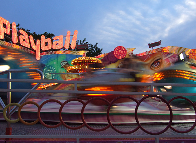
Thanks, BakerBug, for the comments! I really appreciate your taking the time. I will have to play with the cropping of the guard rail to see what I think of it, since you and others commented on it. I didn't mess with it on the first go-round because I thought it helped to anchor all the motion between the foreground and background. This thinking was only happening in the post-processing -- just trying to learn the technique involved in getting motion blur was taking up most of my attention during the shoot! I felt really lucky that I got a couple of images worth looking at!! The close crop on the "P" is the result of the rotation to straighten it. I had a tough time deciding between the image I submitted and this one

I agree that the motion is cleaner and easier to read (which would definitely have helped since many of my commenters mentioned busyness and clutter). The colors and the sky and the big eye tipped the balance at the last microsecond...
Thanks for the welcome, too! So far I have been finding participation on this site to be an excellent and fun way to learn!
Linda |
|
|
|
07/09/2006 10:04:12 AM |
Hello from the Critique Club!
One of the first things I noticed was the guard rail in front of the ride. Since it is in sharp focus, and occupies the bottom 1/3 of the photo, it has become a major element of this shot, but doesn't add much to the overall impact. The second element that captures my attention is the "Playball" sign. This is an important part of the photo, however I feel that it is cropped too close to the left edge. It would help the feeling of this is there were a little bit of the background showing to the left of the "P".
You have done a great job of capturing the motion blur. There is a real feeling of movement and yet enough detail that you can still make out that this is a carnival ride. The lights on the ride are what really bring this out.
After looking through your portfolio, I found this picture you took:
I am really curious to know why you didn't enter this shot. This shot has a much better composition and a more dramatic feeling of motion, but that is just my opinion.
Finally, welcome to DPC! I hope you have as much fun participating on this site as I have. It has been a wonderful learning experience for me. |
|
 Photographer found comment helpful. Photographer found comment helpful. |
Comments Made During the Challenge  |
|
|
07/02/2006 08:10:56 PM |
|
This is a neat idea, but the composition is very cluttered. |
|
| Photographer found comment helpful. |
|
|
07/01/2006 07:16:26 PM |
|
Great colours. I like the clouds in the sky to finish the image. |
|
| Photographer found comment helpful. |
|
|
06/29/2006 10:22:30 PM |
|
Great color! Too bad it wasn't dark outside. I like it.. |
|
| Photographer found comment helpful. |
|
|
06/27/2006 10:11:24 PM |
|
Too chaotic, the rail is disturbing, and I can hardly notice the motion... |
|
| Photographer found comment helpful. |
|
|
06/27/2006 09:01:45 PM |
|
| Photographer found comment helpful. |
|
|
06/27/2006 04:22:56 PM |
|
You've got some nice motion going on here with great sharpness everywhere else. Unfortunately, the image feels like it's too much, too gaudy, and misses some of the drama. My idea when viewing this is that it might be really effective in black and white or duotone. That might also help the dilema of the bright white light at left. I would've done the exact same left crop as you did, even with the light, since the "Playball" text is a good built-in title. |
|
| Photographer found comment helpful. |
|
|
06/27/2006 04:00:16 PM |
|
I've been trying to figure out what this is for a little bit, and I know it's gotta be some kind of ride, but i can't for the life of me tell what that is. Maybe a little to blurred. The railing could have also been avoided. |
|
| Photographer found comment helpful. |
|
|
06/27/2006 10:48:15 AM |
|
|
|
06/26/2006 08:32:48 AM |
|
I'm getting sick just looking at it. LOL The ol' carnival ride. Nice colors here!! |
|
| Photographer found comment helpful. |
|
|
06/26/2006 01:33:04 AM |
|
A little to busy for me... |
|
Home -
Challenges -
Community -
League -
Photos -
Cameras -
Lenses -
Learn -
Help -
Terms of Use -
Privacy -
Top ^
DPChallenge, and website content and design, Copyright © 2001-2026 Challenging Technologies, LLC.
All digital photo copyrights belong to the photographers and may not be used without permission.
Current Server Time: 06/28/2026 04:56:42 AM EDT.