| Author | Thread |
|
|
07/06/2006 04:59:07 PM |
*critique club*
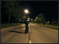
What I'm seeing is a photo that is entirely out of focus. I'm not seeing anything at all in focus and that is what bothers me about this image. The motion blur doesn't add to the photo in my opinion either. In this image, I would prefer to see everything in focus, even the people, which unfortunately makes this a bad choice of image for the challenge.
Not sure how to explain it, but in this instance, having the people blurred doesn't make a lost of sense. You didn't offer any hint as to your purpose of the photo in your Photographer's comments section, so I'm not sure what you intent for the photo was. I don't know if you purposely made everything in the entire photo out of focus or if it was just an accident or whatever. So my critique can be based only on personal opinion.
My advice would have been to set the camera down on something, and use the timer if available. That way, it will eliminate any chance of blurring due to camera shake.
The image seems quite dark as well. It's really hard to see what's going on. Ok, there's a conversation, but since you can't capture the conversation in a photo, we only get to see 2 people sitting, moving a little and they were drinking water by a beach? I'd like to see a main focal point. Something that draws us in and hold us there. The photo lacks interest to anyone who wasn't there to experience it.
The angle and framing are ok. Having the people one on each side of the photo is good. I think that creates balance as far as that goes. However, your horizon is tilted and with those lights in the background, it is blaringly obvious. Pay closer attention to your background when there is such a strong horizontal line.
Overall I think the entire shot needs work, starting with lessening the items that are out of focus.
Fits the challenge though.
~Heather~ |
|
 Photographer found comment helpful. Photographer found comment helpful. |
Comments Made During the Challenge  |
|
|
07/02/2006 05:06:31 PM |
|
Interesting idea, but I think it suffers a bit in execution. Elements that should be in focus are not, like the lights in the background and the water bottles. The effect looks more like camera shake and accident than a deliberate motion shot. |
|
| Photographer found comment helpful. |
|
|
06/28/2006 07:27:40 AM |
|
This is great...a 3D feel. |
|
| Photographer found comment helpful. |
|
|
06/27/2006 10:57:02 PM |
|
Very nice image, love the backdrop. |
|
| Photographer found comment helpful. |
|
|
06/27/2006 05:53:44 PM |
|
The whole image seemds kindof soft and the orange. The movement in the left person doesn't seem natural to me and the person on the right is transparent. I can't tell if the person on the right is also the person on the left but I think that the light needed to be cast on the right subject to give it more substance. |
|
| Photographer found comment helpful. |
|
|
06/27/2006 06:35:56 AM |
|
seems to be too busy the eye doesn;t settle 5 |
|
| Photographer found comment helpful. |
|
|
06/27/2006 03:43:14 AM |
|
it's a bit of a strange one, this. i think there is too much going on in the frame vying for the viewers attention; the beach / coastal background, the person on the left being a bit too solid, the person on the right a bit too see-through, the bottles of water being an out of focus distraction. the coluors feel a bit washed out too; i feel it needs to be bolder, more contrasty. also a bit more light on your subjects? i don't know, simplicity is probably preferable with something like this. 4. |
|
| Photographer found comment helpful. |
|
|
06/27/2006 01:32:44 AM |
|
Nice idea, but the right side image is too faded. Also, I found the blurry lights on the horizon distracting. |
|
| Photographer found comment helpful. |
Home -
Challenges -
Community -
League -
Photos -
Cameras -
Lenses -
Learn -
Help -
Terms of Use -
Privacy -
Top ^
DPChallenge, and website content and design, Copyright © 2001-2026 Challenging Technologies, LLC.
All digital photo copyrights belong to the photographers and may not be used without permission.
Current Server Time: 06/29/2026 12:07:24 AM EDT.