| Author | Thread |
|
|
06/28/2006 02:45:26 PM |
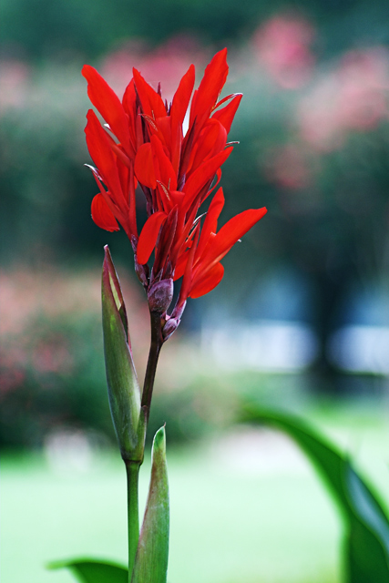
Thanks, Jason. I actually did desaturate (both in RawShooter and Photoshop) due to the red being too strong. The lawn doesn't show that it's blown out according to the histogram, but that doesn't mean it's not too bright for the shot's composition.
Thanks for the critique! |
|
|
|
06/28/2006 02:05:46 PM |
Really I think above 5.5 most shots show a basic grasp of all the techincals needed for a good picture. Then it becomes a matter of subject, "wow" and the small details that raise it above.
I have always found reds to be very hard to control on the Canon sensor. They saturate very very quickly and can look bad. I took a bunch of tulip shots in April and had the exact same problem. This shot may be suffering from that a bit. Try actually desaturating the reds a small amount and see if it looks better. (we rarely think of desaturating things unless we are going for selective desat or B&W).
The bokeh is mainly nice, but I think the lawn section is blown a bit which makes it less appealing. I also don't quite like the two horizontal highlights. Because it makes a pattern, our eyes are drawn to it and away from the subject. It doesn't add to the picture informationally, so it just winds up being a distraction. |
|
 Photographer found comment helpful. Photographer found comment helpful. |
Comments Made During the Challenge  |
|
|
06/27/2006 07:36:27 PM |
|
| Photographer found comment helpful. |
|
|
06/27/2006 12:26:43 PM |
|
Nice capture, the bokeh is a bit distracting, that whitish area middle right draws your eye. |
|
| Photographer found comment helpful. |
|
|
06/25/2006 10:34:57 PM |
|
Great vibrant reds, and well croped. |
|
| Photographer found comment helpful. |
|
|
06/25/2006 05:57:40 PM |
|
Like the use of the vertical crop to let the eye play with the left 1/3 of photo. |
|
| Photographer found comment helpful. |
|
|
06/25/2006 01:32:32 AM |
|
Good work. You certainly got the bokeh working here. |
|
| Photographer found comment helpful. |
|
|
06/24/2006 11:01:47 PM |
|
| Photographer found comment helpful. |
|
|
06/24/2006 06:30:41 PM |
|
Nice sharp image with excellent bokeh |
|
| Photographer found comment helpful. |
|
|
06/22/2006 03:09:04 PM |
|
Definitely meets the challenge and exhibits proper bokeh. The subject matter leaves me wanting (not because it's a flower - I have nothing against flowers - it just lacks a "wow" factor for me). Good luck! |
|
| Photographer found comment helpful. |
|
|
06/21/2006 10:49:56 PM |
|
Vibrant colors. Love the bokeh. Thanks for having bokeh! 8 |
|
| Photographer found comment helpful. |
Home -
Challenges -
Community -
League -
Photos -
Cameras -
Lenses -
Learn -
Help -
Terms of Use -
Privacy -
Top ^
DPChallenge, and website content and design, Copyright © 2001-2026 Challenging Technologies, LLC.
All digital photo copyrights belong to the photographers and may not be used without permission.
Current Server Time: 07/14/2026 06:11:55 PM EDT.