| Author | Thread |
|
|
06/24/2006 05:58:41 AM |
Greetings from the Critique Club
First impression and overall look:
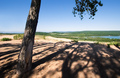
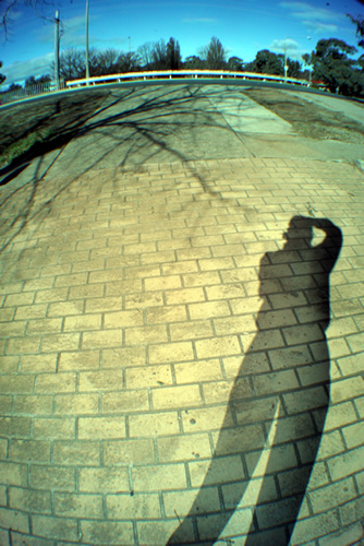
Upon opening the phot I though 'hey cool, nice fisheye'. It immediately grabs your attentions and makes the eye follow the photo counterclockwise. After the shadow, it then meets some distracting fences and bushes though. These don't really do well in the fisheye perspective, in my opinion. After that the eye comes to the shadow of the tree, and that makes a fine closing argument for the picture. The two shadows balance each other out nicely.
Technical and post processing:
I wonder why you chose an ISO of 800 for this photo. There is plenty of light available, why not go for 400 or even 200? Next thing I noticed is that the photo is smaller than the maximum allowed size. Personally, I would always go for the largest size possible. It is much more relaxing to look at. File size is smaller than allowed too, although I don't see any artifacts here, so that's not really a problem.
The color of the photo is slightly shifted towards the green. A bit of photoshopping can correct that. Also, the colors are a bit flat, try upping the saturation a notch.
Meeting the challenge:
Does meet the challenge well, although I think you could have been a bit more creative. The fish eye is the only thing that gives this shot a bit extra interest, but apart from that, there's nothing much to see.
How to reaise your score:
There's not much of a wow factor in the shot. The fisheye is the only thing that makes it slightly interesting, but after that it falls a bit flat. DPC'ers like to be awed at a shot, and this shot is not one of them. Also, if the background were a bit more of interest it could give you a few more decimals. |
|
 Photographer found comment helpful. Photographer found comment helpful. |
Comments Made During the Challenge  |
|
|
06/18/2006 10:19:51 AM |
That's one fancy fisheye! Great shto, you look taller than in real life ;-)
Hope you do well! |
|
| Photographer found comment helpful. |
|
|
06/18/2006 04:22:19 AM |
|
| Photographer found comment helpful. |
|
|
06/16/2006 01:20:14 PM |
Challenge: SHADOWS III
Description: Creatively capture a shadow
Advanced Edit
Shadows have a life too
Fit: Clearly meets the challenge 1
Aesthetics: OK composition 1
The wide angle/fish eye lens doesn't quite do it for me in this composition
Technical: Technically well executed 2
Wow: Has some impact 1
Just feels as though there is too much going on in the picture for the eye to get a focus on.
Total Score = 5 |
|
| Photographer found comment helpful. |
|
|
06/15/2006 11:57:04 PM |
|
This is a little too "snap shotty" for my taste. |
|
| Photographer found comment helpful. |
|
|
06/15/2006 07:27:01 AM |
|
Yes...they certainly do...I like the fish angled look. |
|
| Photographer found comment helpful. |
|
|
06/13/2006 11:40:32 PM |
|
this one's not really working for me, I am not sure I am getting the meaning. I spent some time on it, will come back later |
|
| Photographer found comment helpful. |
|
|
06/13/2006 11:20:05 AM |
|
I think the arched or balloon effect you put on the photo really takes away from the photo. |
|
| Photographer found comment helpful. |
|
|
06/12/2006 09:28:06 AM |
|
| Photographer found comment helpful. |
Home -
Challenges -
Community -
League -
Photos -
Cameras -
Lenses -
Learn -
Help -
Terms of Use -
Privacy -
Top ^
DPChallenge, and website content and design, Copyright © 2001-2026 Challenging Technologies, LLC.
All digital photo copyrights belong to the photographers and may not be used without permission.
Current Server Time: 07/01/2026 01:08:16 PM EDT.