Author Thread Comments Made During the Challenge
Post actions
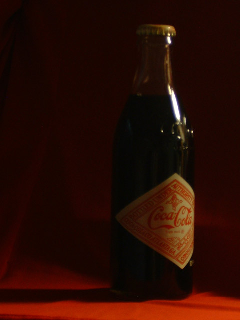
This low key photo is well done. I like that the label is readable and the simplicity of 4 basic colors contributes to the overall aesthetic.
Post actions
I think this image would work better if it was in sharper focus. Lighting and placement is good, Colors are nice too. Good luck!
Post actions
Nice use of negative space to enhance the bottle.
Post actions
good perspective and colors. looks a little out of focus though IMO...although if you were going for a softer look - you got it and it's nice. either way i didnt factor that in my judging. nice work.
Post actions
A great old bottle...the picture is a bit out of focus and a little too dark IMO, but it's a wonderful idea! :)
Post actions
I would have given a much higher score if thr lighting had been better.
Post actions
I would have rated higher if it was focused better.
Post actions
Post actions
I would have preferred the whole botle in focus but a worthy challenge submission.
Post actions
Good idea, and I would have liked to have given you higher marks. However, because of the general fuzziness of the image, I must lower the rating. A tripod would have probably solved this problem. Also, a little more light would improve it dramatically, in my opinion
Post actions
nice subject,bad lighting !





 Add photograph to your favorites
 Add photographer to your favorites


 Photographer found comment helpful.


