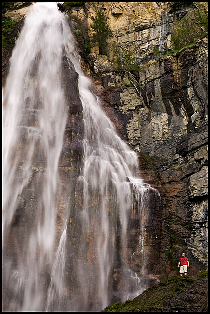
This shot is great Becky. I like the muted tones and the fact that you included a figure for scale. However, I feel that the composition is a bit awkward with so much of the waterfall being cut off at the left.
Camera Work/Technical: Your choice of settings provided a nice soft feeling to the waterfall while keeping all elements in the image crisply focused. Your tones and coloring are exactly what my eye would expect to see.
Lighting: Your lighting is also very nice. You achieved a nice balance between contrasting lights and darks, yet very little detail was lost with blown highlights or harsh shadows.
Composition/Content: Your composition for this one feels a little cramped. I think including more of the waterfall at the top of the frame would alleviate this tension.
My Opinion: I, along with the voters, prefer the fist image more. While I am not a big fan of soft waterfalls, the softness that you achieved with your first entry, as well as a better shooting position, made it a better photograph. I believe that this one scored pretty close to its potential.
Your title really sums it up here, and the guy looking upward is effective. An improvement may be to clone out the white dot just to the left and above the guy.






 Add photograph to your favorites
 Add photographer to your favorites

 Photographer found comment helpful.


