| Author | Thread |
|
|
03/05/2007 11:30:15 AM |
|
IMO ... a SUPER image ... a SUPER crop ... but PLEASE PLEASE PLEASE half the thickness of the black border? |
|
 Photographer found comment helpful. Photographer found comment helpful. |
|
|
06/13/2006 03:38:45 AM |
::: Critique Club :::
Hi, my name is Kari and from the critique club.
First Impression - the most important one:
Great choice for a reshoot ... and a totally different image created .. and let me say .. that is based on the comments you received.
Subject:
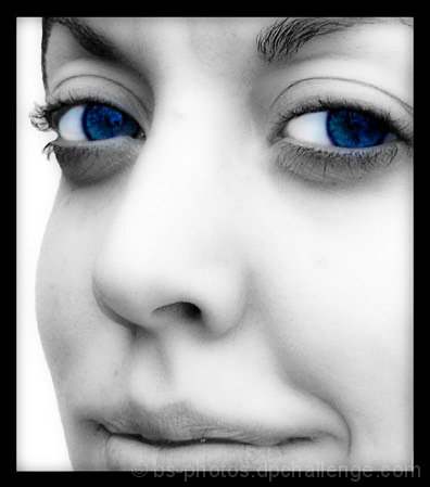
Meets the challenge ... and does so in such a way that you can not tell the original ... I personally think that is a great take on this challenge. You took one of the low scoring and turned out something which just doesn't compare.
Composition:
I think this is interesing .. I think the crop is a little tight on the face .. slightly extending to include full lower lip .. and perhaps some chin and maybe a little forehead ... but I personally like what you have achieved here. I think though that you should have maximised the impact of the picture through its sizing .. and going to 640 on the long side ...
Technical (Colour and light):
I love the lighting you have used ... you don't have that plastic look of two much neat image (just) .. you have shadows where they should be e.g. on the creases .. and just a nice touch of teeth. I think that the eyes may be considered overdone by some .. so a touch lighter may also create the impact without the overperformance.
To grow its vote?:
I think maximise size .. and from that size you can see what else of the face you keep in the shot ...
Summary:
Great work ... I really like this improved shot. Keep it up.
If you've got any questions about this critique, please feel free to contact me via the PM system.
Cheers
Kari |
|
| Photographer found comment helpful. |
Comments Made During the Challenge  |
|
|
06/12/2006 11:36:50 PM |
|
This has very good detail and light. I really like the eyes color too. The crop is a bit too tight for my tastes. |
|
| Photographer found comment helpful. |
|
|
06/10/2006 07:54:17 PM |
|
Good composition...the border is too heavy for the softness of the face though. |
|
| Photographer found comment helpful. |
|
|
06/09/2006 07:49:56 PM |
|
i think the heavy borader takes away, i find this difficult as maybe you got a comment before to make the border more |
|
| Photographer found comment helpful. |
|
|
06/08/2006 05:41:42 AM |
|
I think that a bigger photo would have been better. |
|
| Photographer found comment helpful. |
|
|
06/08/2006 12:21:16 AM |
|
This is lovely but a very small picture, which through being small has lost the maximum impact that could have been created. |
|
| Photographer found comment helpful. |
|
|
06/06/2006 01:18:05 PM |
|
As with other portaits in this challenge the emphasis has been on the eyes, however in this shot i think you have overdone them. I don't like the tight crop either. |
|
| Photographer found comment helpful. |
|
|
06/06/2006 12:29:31 AM |
|
| Photographer found comment helpful. |
Home -
Challenges -
Community -
League -
Photos -
Cameras -
Lenses -
Learn -
Help -
Terms of Use -
Privacy -
Top ^
DPChallenge, and website content and design, Copyright © 2001-2026 Challenging Technologies, LLC.
All digital photo copyrights belong to the photographers and may not be used without permission.
Current Server Time: 06/30/2026 12:47:53 PM EDT.