| Author | Thread |
|
|
06/13/2006 03:21:16 PM |
Hey there from the Critique Club
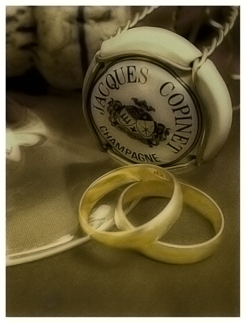
Camera Work/Technical: You captured a tremendous amount of detail, but the soft effect is a bit too much. I understand the effect that you were after, but I think a little less of it would have made this image even better. I do like the tones and colors you created, I'd just like to see a little more crisp.
Lighting: The lighting you chose for this type of image is near flawless. Every elements in the image is nicely lit, and no detail was lost in any harsh shadow or blow highlight.
Composition/Content: Your composition is much, much stronger for this image. You chose much better angles for your element positioning, thus creating a much more inviting flow to the photograph.
My Opinion: It is much better than the original, but could be even better with just slight adjustments. Tone down the softness just a bit and this one would have done much better for you.
Eric
|
|
 Photographer found comment helpful. Photographer found comment helpful. |
Comments Made During the Challenge  |
|
|
06/12/2006 05:18:07 PM |
|
This shot would work better if you made the rings stand out some more. You can use masks in advanced editing, so yo could have boosted the saturation of only the rings. Apart from that still a nice shot. |
|
| Photographer found comment helpful. |
|
|
06/10/2006 07:44:08 PM |
|
| Photographer found comment helpful. |
|
|
06/08/2006 09:12:34 AM |
Strange colour on the rings.
Cropping and setup is good. |
|
| Photographer found comment helpful. |
|
|
06/08/2006 04:39:11 AM |
|
| Photographer found comment helpful. |
|
|
06/07/2006 03:57:50 PM |
|
the softness works well here, good job-9- |
|
| Photographer found comment helpful. |
|
|
06/06/2006 02:56:08 PM |
Very nice, I like this composition. Very good tones and PP. Well done!
Edit to add...just came across your first attempt of this photo quite by surprise. So I thought I would just come back and let you know this is a very nice improvement. The lighting of the first was very harsh, the softness here is very nice and is fitting for the subject matter. |
|
| Photographer found comment helpful. |
Home -
Challenges -
Community -
League -
Photos -
Cameras -
Lenses -
Learn -
Help -
Terms of Use -
Privacy -
Top ^
DPChallenge, and website content and design, Copyright © 2001-2026 Challenging Technologies, LLC.
All digital photo copyrights belong to the photographers and may not be used without permission.
Current Server Time: 07/01/2026 01:11:16 AM EDT.