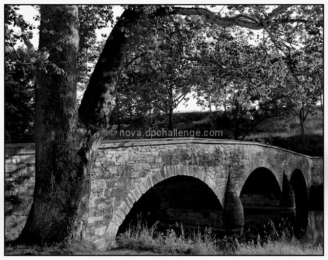
I really like the boost in contrast. The blacks are very black which allows the midtones to stand out much better. I also like the composition. The inclusion of the tree gives a very nice starting point to read this image. The bridge takes up less real estate yet it stands out more. Great job with that!
Very nice job in making the bridge more of the focus in this photo. I enjoy the compositional changes you made (especially getting rid of the distracting wall in the forground) having the bridge lead you more throught the photo. Better lighting in this one and the change in seasons also adds to the photo (not that you could have done anything about that in your original) :-) Very nice job.
Assuming I've got the original right, I think this version is much improved. A much stronger, more solid composition with nice lines and definitately a better b/w conversion with more contrast. Perhaps a tiny bit too dark under the arches but that doesn't bother me at all. Nicely done.
You did well on your "do-over"! I like this composition much better and you have a nice tonal range in the B/W pp. Good luck! p.s. - I didn't read the comments on your other image, so I'm not sure what changes you were going after. Another p.s. - I didn't vote on this as I'm not voting on any images in this challenge.
Not sure if you used B&W in the first take,but this is goodif you had selected the leading front of the bridge, and raised level about 5 would have come up well...8






 Add photograph to your favorites
 Add photographer to your favorites


 Photographer found comment helpful.


