| Author | Thread |
|
|
06/13/2006 03:01:44 AM |
::: Critique Club :::
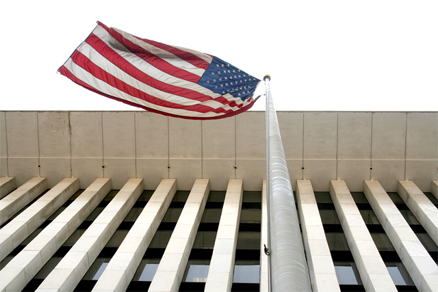
Hi, my name is Kari and from the critique club.
First Impression - the most important one:
You have answered an age old question .. how can you improve the score of a picture ... make it a retake of one that has previously been DQed :) Well done .. and good on you for meeting the rules.
Subject:
This definately meets the challenge ... and does so with gusto.
Composition:
The flag is on vertical thirds .. with the top of the pole being on horizontal thirds ... the interest or leading lines may have worked better if mirrored and you then would look up the pole then right along the flag .. a more natural movement than the eyes going left on an image... I also like that you can see more of the flag itself ...
Technical (Colour and light):
Well the sky is a definate improvement on the prevoious .. but don't you guys have blue skies by dnow .. cos ours are really grey and misrable. I love the natural light and that you have taken the time to remove the stains ..
To grow its vote?:
I think trying a mirror on the image ... also .. really get a natural blue sky .. I think that would increse the score huge.
Summary:
Great work ... well done .. you are certainly improving.
If you've got any questions about this critique, please feel free to contact me via the PM system.
Cheers
Kari |
|
 Photographer found comment helpful. Photographer found comment helpful. |
Comments Made During the Challenge  |
|
|
06/11/2006 04:32:42 PM |
|
Looks just fine without the generated clouds. :-) |
|
| Photographer found comment helpful. |
|
|
06/10/2006 12:26:49 AM |
|
Great angle...whoa...you are making me dizzy!! |
|
| Photographer found comment helpful. |
|
|
06/08/2006 08:35:10 AM |
Enough with your flag!!!
It's a symbol of so many thing that you should be ashamed of. |
|
|
|
06/08/2006 03:13:58 AM |
|
DQ! from the rules somewhere: "You are not allowed to point the camera up at steep angles" LOL - kidding ya. This is good. No blue sky, but whatcanyado. :) |
|
| Photographer found comment helpful. |
|
|
06/07/2006 08:21:20 PM |
|
Seems to much light in the top of the picture. Don't know the original so I don't know wheither you did better or worse. |
|
| Photographer found comment helpful. |
Home -
Challenges -
Community -
League -
Photos -
Cameras -
Lenses -
Learn -
Help -
Terms of Use -
Privacy -
Top ^
DPChallenge, and website content and design, Copyright © 2001-2026 Challenging Technologies, LLC.
All digital photo copyrights belong to the photographers and may not be used without permission.
Current Server Time: 07/02/2026 03:58:46 PM EDT.