| Author | Thread |
|
|
06/24/2006 03:05:44 PM |
Greetings from your own critique club.
First Impression
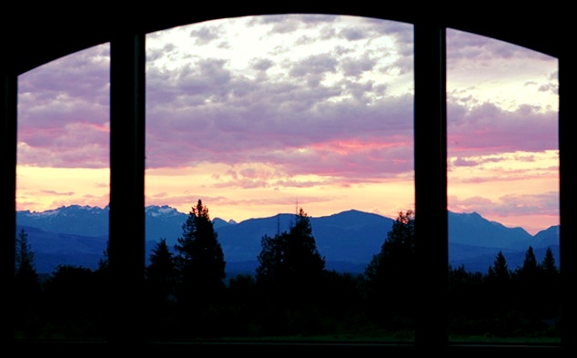
Colors add little more to this comapre to the original.
Composition:
Height is just 393 pixels. I would like to see more height.
Subject:
Improvement over the origianl in terms of colors and interesting coulds. But the composition is almost smae. I don't know if there were any comments on the original about the height.
Technical (Colour and light):
The color and lighting okay.
Improvement:
Different composition which allows more height.
Summary:
Just notices the take two is almost same score as the original.
Keep Shooting, Cheers!!! |
|
 Photographer found comment helpful. Photographer found comment helpful. |
|
|
06/15/2006 10:08:01 AM |
CTCP2 Gunnsi
First impression:
It is dark and overblown. Beautiful colours there in between.
I like the other one more than I do this one.
What can you do better?
It is better to take a dark photograph of clouds and use post processing to lighten it up with levels. It is impossible to fix blown clouds. I am no expert but my "Fool on the Hill" photo is a good example on clouds before and after.
|
|
| Photographer found comment helpful. |
Comments Made During the Challenge  |
|
|
06/12/2006 09:11:36 PM |
|
Nice sunset, but the original image seems to be better overall. I can't figure out why. Maybe it seems to have better clarity. Anyway, it is nice to see the various moods one window can give you. Quite a view if that is what you get to look at every day. |
|
| Photographer found comment helpful. |
|
|
06/11/2006 11:26:47 PM |
|
Nice contrast of blues and pinks...very nice light. 8 |
|
| Photographer found comment helpful. |
|
|
06/10/2006 12:26:12 AM |
|
Great colours. I like the blues of the hills. |
|
| Photographer found comment helpful. |
|
|
06/06/2006 07:32:02 AM |
|
The sky is beautiful but also a little blown out at the top. |
|
| Photographer found comment helpful. |
|
|
06/06/2006 05:41:28 AM |
|
Not sure if you were taking the frame out of the equation, but maybe a fill flash to put some light on the frame, this type of shot is very hard to be able to balance the light on both subjects....5 |
|
| Photographer found comment helpful. |
Home -
Challenges -
Community -
League -
Photos -
Cameras -
Lenses -
Learn -
Help -
Terms of Use -
Privacy -
Top ^
DPChallenge, and website content and design, Copyright © 2001-2026 Challenging Technologies, LLC.
All digital photo copyrights belong to the photographers and may not be used without permission.
Current Server Time: 06/29/2026 08:30:36 PM EDT.