| Author | Thread |
|
|
06/07/2006 04:46:20 PM |
::: Greetings from Critique Club :::
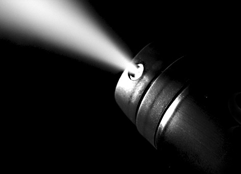
Hi, as requested, here is an indepth critique of your submission.
First Impression - the most important one:
Nice shot, but a little small. Why not go for the full 640 pixels wide?
Composition:
I like the diagonal composition of this shot. It works well for it.
Subject:
Clear and stands out well against the negative space.
Technical (Color, focus, and light):
Color: The black and white treatment is good here. Good midtone contrast. Works well.
Focus is sharp. Especially for a hit and run shot :-)
Light: This is good. A few hot spots here and there. You might want to diffuse the light a bit more for similar shots.
To grow its vote?:
I think it's kinda under-rated, but the image size probably hurt you some. Also, ther is a hot pixel on the can that could have easily been cloned out.
Summary:
Cool shot, definitely under-rated. Keep up the good work and the scores will come to you.
Hope to see more from you soon,
Leroy |
|
 Photographer found comment helpful. Photographer found comment helpful. |
|
|
06/07/2006 06:48:55 AM |
|
Thank you for commenting and voting! |
|
Comments Made During the Challenge  |
|
|
06/06/2006 01:06:36 AM |
|
Great technique, but doesn't give me much. 6. |
|
| Photographer found comment helpful. |
|
|
06/02/2006 04:37:17 PM |
|
| Photographer found comment helpful. |
|
|
06/01/2006 02:11:23 PM |
|
took me a minute to figure out but very clever. |
|
| Photographer found comment helpful. |
|
|
05/31/2006 06:57:15 PM |
|
lol, cute title and nice pic, 9 |
|
| Photographer found comment helpful. |
|
|
05/31/2006 04:09:56 AM |
|
Good focus. Nicely composed. Good use of single light source. |
|
| Photographer found comment helpful. |
Home -
Challenges -
Community -
League -
Photos -
Cameras -
Lenses -
Learn -
Help -
Terms of Use -
Privacy -
Top ^
DPChallenge, and website content and design, Copyright © 2001-2026 Challenging Technologies, LLC.
All digital photo copyrights belong to the photographers and may not be used without permission.
Current Server Time: 06/29/2026 12:04:23 AM EDT.