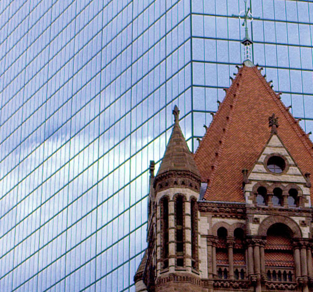
This is Trinity church in the heart of Boston - its > 100 years old and in the Romanesque tradition.
In the background is the John Hancock tower - one of the largest skyscrapers. I.M.Pei designed it to appear invisible and not stick out by using reflecting mirrors for the glass windows.
I wanted to bring out the contrast between the 2 buildings - one modern and one older but the height differences kept getting in the way so I decided to use each building to do what it was designed to do and bring out the differences in the intricate architecture and clean straight modern lines
Statistics
Place: 244 out of 281 Avg (all users): 4.9109 Avg (commenters): 5.5000 Avg (participants): 4.7117 Avg (non-participants): 5.1538 Views since voting: 992 Views during voting: 295 Votes: 202 Comments: 14 Favorites: 0
Camera Work/Technical: It is very difficult to determine if this image is focused or not. There is a great deal of noise in the capture, but the focus looks off to me.
Lighting: Very nice, very even lighting. Nothing is overexposed, and the shadows work nicely to provide contrast to the image.
Composition/Content: I like what you were after here. Old and new together and the tug or urban renewal v. history. I'd really like to see the rest of the church, so backing out from the tight crop would have looked a little better.
My Opinion: A nicely seen image, but the technical side needs some work. The good news is that technical aspects are the easiest to remedy. I think that this one scored pretty close to its potential.
Thanks for the views and comments all .. this was my first entry and I should have been focusing on the church instead of the tower - the clouds were pretty light and I wanted to make sure they came out right.
It was a last minute submission and having never done it I didn't know how to resize and make it web viewable better - I just kept dropping jpg quality to make it smaller. Since then I've read EddyG's tutorial on this so I should do better next time
This image has a lot of noise in it, or it has been overprocessed in Photoshop. It is an interesting idea placing the old and new against each other, but the quality of the image isn't working for me.
This seems a bit blurry and out of focus. Shame as the Trinity Church in Boston by architect Henry Hobson is truly a magnificent piece of architecture ;)
This is an absolutely fantastic subject and composition- It has an interesting sort of Matrix background that is intriguing. It seems just a pinch OOF or needs a little chapness at least and perhaps some noise reduction. The cross or icon at the top of the building could be brought out a little but it is interesting the way is sorta fades into the background. 7





 Add photograph to your favorites
 Add photographer to your favorites

 Photographer found comment helpful.


