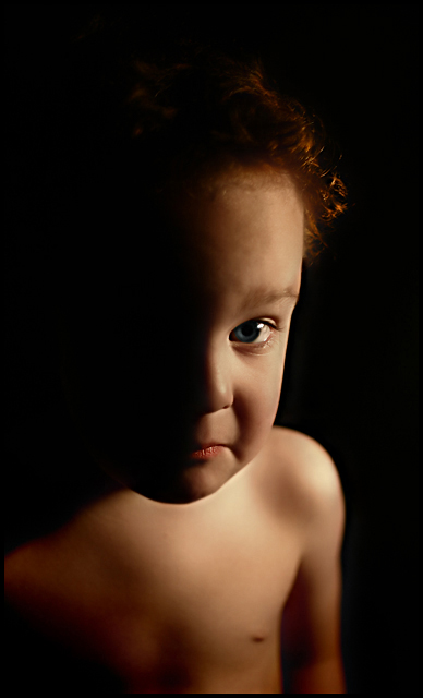
I took this shot of my son in our garage with a 70 watt desk lamp with a homemade diffuser on it. He was sitting up on a wobbly stool in the dark and wasnt really too happy about it all. I was basically trying stuff out to see what would work. Everything else I tried afterwards wasnt as clean. This was kind of funny so I figured what the heck.
cropped, burned, dodged hair and eye, adjusted saturation on body and eye separately, unsharpen mask, border, save for web, then decreased saturation in his pupil. Tried a version with NeatIMage but comparing them side by side I didnt think it really needed it afterall - so NO NEATIMAGE ON THIS ONE.
Statistics
Place: 56 out of 238 Avg (all users): 6.0269 Avg (commenters): 6.2143 Avg (participants): 5.8077 Avg (non-participants): 6.1209 Views since voting: 1265 Views during voting: 351 Votes: 260 Comments: 26 Favorites: 0
Composition I like the tall crop but the composition does seem possibly a tiny bit too centred, with the eye almost right in the middle both vertically and horizontally.
Technical stuff (exposure, dof, lighting etc…) I love the lighting, leaving one side of the face very dark. The shallow dof gives a very soft look.
Meeting the challenge Yeah, very nicely lit.
Post-processing I'm not sure if it was PP work or if it was due to the lighitng, but his chin seems to stand out against his chest more than it should, which makes it a little disjointed.
My personal opinion I haven't decided if I like this style or not - I'm used to seeing portraits very sharp, and this is much more coft and dreamy. If you achieved that effect through NI I wouldn't like it,but I think I;m growing to love it. His expressin is certainly perfect.
Composition/subject He's still a cute kid. Looks a lot like his dad, if you ask me. :-) I almost think this needs a bit more room, or less - more of a square crop, maybe, or crop just above the armpit?
Technical Seems sharpest on his lips and a bit soft on the eye - I'd prefer it the other way 'round. Post processing seems to be very good - by that I mean I can't tell it's been post-processed.
Meets challenge Yep. Single light source appears to have been used. I do like how the light highlights his curls just "so".
My opinion More 6s than 5s, more 7s than 4s - I'd say that's pretty good as far as pleasing the "client". I just really like the way he's looking at the camera.
Camera Work/Technical: Man, that's nice focus on the most important part of the subject. Add to that the terrific depth of field you used, and you end up with a great shot.
Lighting: Very creative and very interesting. I really like the profile-type of image you produced with your light positioning.
Composition/Content: Very nice. While the lit part of the face is centered, the rest of the image works very well to keep the eye flowing. The centering adds strength to the image.
My Opinion: Well seen, well captured and well processed. Another fine production.
Trading post...
What pretty blue eyes (or should I say eye?). Nice job here. I'm not to sure about the DOF though, it kind of looks like his head isn't really connected to that body. It could just be because of the way the shadow fell. He's not looking too happy though.
Trying to catch up on some of the comments I'm behind on....
I really like this. I like the skintone, and I really like the blue eye. The single light source is very obvious and very well done. The composition is a bit centered and thus feels static, but I'm not sure if it would look better off center or not.
You've really captured personality well in this shot. The expression and character of your model are terrific. Focus is very sharp on his face, especially his eye. The color of his eye is very compelling, might even be better if a bit more of it came through. I would have liked a little more DOF because it almost looks like his body is not connected to his face, as if you made a picture of his face and pasted it onto another picture of his body. It may just be me, but a little sharper torso would not have me thinking this way. I scored this a 6 and would have gone higher but for the disconnect I felt between head and torso due to DOF choice.
I just read some of the comments below; I don't have any problem with the dark shadow on half his face.





 Add photograph to your favorites
 Add photographer to your favorites

 Photographer found comment helpful.


