| Author | Thread |
|
|
06/25/2006 07:43:36 AM |
|
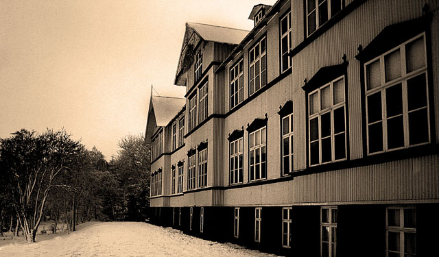
I like the perspective here and the old feeling you gave the picture. I wouldn't have guessed it was taken at night. I wish the line of trees came up a bit further to give more definition to the path that goes along the building.. perhaps cropping just a bit off of the left side so you don't see the end of the tree line? Well done... I think it should have scored higher than it did. |
|
 Photographer found comment helpful. Photographer found comment helpful. |
|
|
06/06/2006 12:57:02 PM |
Hello from the Critique Club!
Well Krisby, I must say your work has greatly improved the past few months and I am quite impressed with this shot.
I really like the old feeling of this, it adds emotion to a shot of a building, which is an accomplishment in itself.
I see some noise in the sky, using a little neatimage could reduce that. Also there are some glowing edges around the pointed tops of the buildings that are a distraction. I think toning them down would help.
There is a tutorial on dodging and burning on this site that you could look into. If you go slightly easier on the levels, and the dodge the building a bit, you should be able to get the brightness and the details without blowing out the sky.
I like the perspective, it's interesting and leads the eye beyond the building, which makes viewers think for a second instead of just taking a quick glance.
Don't let the 5.3 get you down, I personally feel that this deserves closer to a 6 than that. Good work. It's nice to see you experimenting.
-Monica |
|
| Photographer found comment helpful. |
|
|
06/05/2006 01:09:10 PM |
|
This does feel a bit like an old postcard. It has that "weathered" feeling to it. |
|
| Photographer found comment helpful. |
Comments Made During the Challenge  |
|
|
06/03/2006 07:08:09 PM |
|
Reminds me of a postcard for an old hotel. Is that snow? Nice POV. |
|
| Photographer found comment helpful. |
|
|
06/01/2006 07:37:29 AM |
|
I don't like this sepia tone. |
|
| Photographer found comment helpful. |
|
|
05/30/2006 08:19:08 AM |
|
good, nice postprocessing ... |
|
| Photographer found comment helpful. |
|
|
05/29/2006 12:49:28 PM |
|
| Photographer found comment helpful. |
Home -
Challenges -
Community -
League -
Photos -
Cameras -
Lenses -
Learn -
Help -
Terms of Use -
Privacy -
Top ^
DPChallenge, and website content and design, Copyright © 2001-2026 Challenging Technologies, LLC.
All digital photo copyrights belong to the photographers and may not be used without permission.
Current Server Time: 07/01/2026 11:17:18 AM EDT.