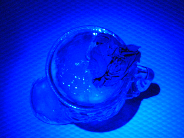
A cowboy-boot beer mug with a dried rose floating atop. Trying to epitomize the sadness of knowing a relationship has hit the skids, and the temptaion to drown your sorrows.
Statistics
Place: 117 out of 129 Avg (all users): 3.4429 Avg (commenters): 3.1875 Avg (participants): 3.2174 Avg (non-participants): 3.5029 Views since voting: 1289 Views during voting: 348 Votes: 219 Comments: 18 Favorites: 0
First Impression - the most important one: I don't understand how the title relates .. until I read your comments .. so will base the critique on what you were trying to achieve and how to best meet that as well as the image you created.
Composition: Background is so very important and from this angle the backgroun detracts from the actual image .. something flat may have helped here rather than the heavy texture. do a search on 'rule of thirds" I have learn lots about composition using this rule . .. also the golden triange .. and leading lines.
Subject: Not as it is pictured .. but your concept does - you just haven't pulled it off.
I think that the blue you have used does not work .. and the angle of the shot detracts from the boot and the rose as both are almost entirely lost in this picture.
Technical (Colour and light): The imaage does not appear sharp. The flaring off the water is a little bit of an issue but the colour blue has basically killed the shot. It is a little too bright t depict the sadness. A naturally dying rose in the boot from the side wtih a mild tope angle on it may have actually portrayed what you are looking for and created the emotion without the need or colour saturation.
To grow its vote?: Think about how others will see the shot, and the impression it will leave on them. Take into account that things like failure are self determined and that people will judge on their own experience.
Summary: you did ok .. keep it up you will do better i am sure in future.
If you've got any questions about this critique, please feel free to contact me via
the PM system.
This hurts my eyes. It looks like the light source might have been too close- I would try to move the light back so it's not so concentrated, and it might also help detail in the photo stick out more.
Sorry but the image quality is pretty bad here and that is why I gave it a poor rating. It´s so bad I can´t even make out what I am looking at here. Sorry, the reason for me to say this is because I make it a rule to explain when I give a low rating.
I don't get how this relates to the challenge; and the blue is overpowering, and detrimental to the image. I can't even tell exactly what I'm looking at; it's a cup...that's about it.
It is really hard to tell what the subject is in this shot. I can make out a glass, but the focus, coloring, and exposure work to blend everything together.
There is way too much harsh blue light in the picture for my taste. I can barely tell that there is a rose there and can't tell anything else about the rest of the picture. It would have been better to me (as a matter of personal taste) if your angle wasn't so close to top-down and if the light was set up in such a way that I could still see the color of the rose to show up without being washed out in blue.






 Add photograph to your favorites
 Add photographer to your favorites

 Photographer found comment helpful.


