| Author | Thread |
Comments Made During the Challenge  |
|
|
08/26/2003 10:06:36 PM |
|
it took me a moment to figure out the relavance of the title. |
|
 Photographer found comment helpful. Photographer found comment helpful. |
|
|
08/24/2003 08:47:59 PM |
|
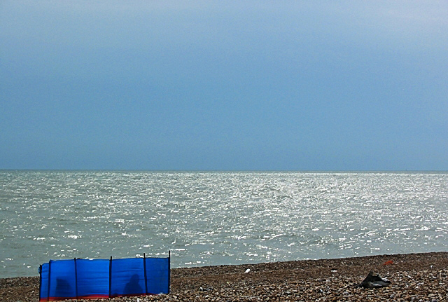
are those people hiding in there? i feel the cropping is a bit awkward. too tightly cropped on the blue object at the bottom. |
|
| Photographer found comment helpful. |
|
|
08/22/2003 11:05:56 PM |
|
I really love this shot! I love the different shades of blue contrasting nicely with the dark tan sand. And the glare off the water really create a wonderful moody picture. The underexposure youi've chosen really works well here and the composition is very good as well. Only thing is I think there is too much sky, but that's just me...giving a high score. |
|
| Photographer found comment helpful. |
|
|
08/22/2003 04:52:36 PM |
|
What is on the right side of this picture? I see something gray and a smaller red object. I am not sure this captures the idea of representing a season. |
|
| Photographer found comment helpful. |
|
|
08/22/2003 12:18:07 PM |
|
This picture comes off a little flat. Not very multi dimensioal |
|
| Photographer found comment helpful. |
|
|
08/22/2003 09:41:36 AM |
|
| Photographer found comment helpful. |
|
|
08/20/2003 10:33:52 PM |
|
Too much negative space here. If the subject were up and to the right a bit, I think it might have been okay. |
|
| Photographer found comment helpful. |
|
|
08/20/2003 07:02:28 PM |
|
Simple composition but effective. |
|
| Photographer found comment helpful. |
|
|
08/20/2003 02:38:43 PM |
|
Nice idea. Central horizon spoils it. Prefer 1/3rds. |
|
| Photographer found comment helpful. |
|
|
08/20/2003 12:46:34 PM |
|
| Photographer found comment helpful. |
|
|
08/20/2003 05:40:07 AM |
Nice composition. IMO is cropped a little bit too much at bottom.
I like the aesthetic. 7 |
|
| Photographer found comment helpful. |
Home -
Challenges -
Community -
League -
Photos -
Cameras -
Lenses -
Learn -
Help -
Terms of Use -
Privacy -
Top ^
DPChallenge, and website content and design, Copyright © 2001-2026 Challenging Technologies, LLC.
All digital photo copyrights belong to the photographers and may not be used without permission.
Current Server Time: 06/28/2026 05:06:45 AM EDT.