Greetings from the critique club,
This is a tough one for me to critique. I have spent a long time looking at it, and I am struggling to put my finger on exactly what I would suggest to improve it. Here are my thoughts ...
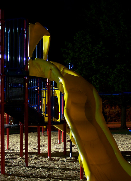
This is very nicely exposed for a night shot. I like the details in both the highlights and the shadows. It is nice and sharp, even with the long exposure.
I like the light coming in from the side and below. It has an eerie quality, which seems appropriate for an empty playground at night. Kind of creepy.
I like the idea of having the slide come down and meet the bottom corner, but I feel like the composition is a bit unbalanced. The empty space on the right side doesn't seem like effective use of negative space to me. The interesting parts of the image are the lines of the bars and they are all clustered on the left side but somehow I find my eye staring out into the emptiness over on the right. It is hard to explain, but it lessens the impact of the iamge for me. The best suggestion I can think of would be to somehow crop in tighter without losing the long leading line of the slide.
Cheers,
Liza |






 Add photograph to your favorites
 Add photographer to your favorites


