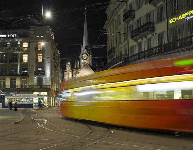
This is a difficult image for me to give a long critique for as there isn't much I would've done differently. A tighter crop on the right would've gotten rid of the distracting neon sign. It really pulls your eye away from the subject. If you'd have cropped it tighter on the left you'd have taken the hotel sign out but the people as well. I think the shot needs the people so I think it's good over there.
Overall a very nice shot and probably would've scored better if there wasn't a similar image entered in the same challenge.
Thanks for the opportunity to critique this shot Alexej.
Oh,this image comes sooo close! Love the movement in the tram. But think about cropping it to eliminate the signs "hotel" and "schaepp.." You still get all the effect of the moving vehicle without the distractions of the lettering.
What!? Didn't I already see this in the challenge? In any case, thise one is better excecuted than the previous one I saw. However, the neon yellow sign on the upper right is very distracting.
So... was this an organized photoshoot or the biggest coincidence in dpc history? I voted on a VERY similar shot not two minutes ago. This is wider, but it's not a different viewpoint.





 Add photograph to your favorites
 Add photographer to your favorites

 Photographer found comment helpful.


