| Author | Thread |
Comments Made During the Challenge  |
|
|
05/16/2006 08:33:49 AM |
|
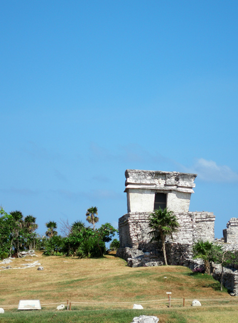
if u could zoom in a little more, it would make a little more appealing. |
|
 Photographer found comment helpful. Photographer found comment helpful. |
|
|
05/13/2006 10:25:32 PM |
|
too much blue sky for me. I would like to see more fo the ruins. |
|
| Photographer found comment helpful. |
|
|
05/13/2006 08:10:08 PM |
|
| Photographer found comment helpful. |
|
|
05/13/2006 03:41:47 PM |
|
This photo is OOF and the wires are distracting. |
|
|
|
05/13/2006 02:50:20 PM |
|
Nice shot! love that place! |
|
| Photographer found comment helpful. |
|
|
05/13/2006 10:06:43 AM |
|
Beautiful place and a very nice photograph. But I like it better if you cropped off like half of the sky.. |
|
| Photographer found comment helpful. |
|
|
05/12/2006 07:50:16 PM |
|
I really want to see closer shots of the ruins. The fence or rope in the foreground is a bit distracting. Other than that I quite like this. |
|
| Photographer found comment helpful. |
|
|
05/12/2006 02:19:24 PM |
|
Lost a bit in the composition. |
|
| Photographer found comment helpful. |
|
|
05/12/2006 09:52:14 AM |
|
I love this place. Great idea! Interesting comp nice colors could be a bit sharper. |
|
| Photographer found comment helpful. |
|
|
05/11/2006 08:21:46 PM |
|
Nicely done. I believe that this could have benefited from a tighter crop which would remove the white lines in the foreground. |
|
| Photographer found comment helpful. |
|
|
05/11/2006 04:14:38 PM |
|
cool place. too bad the composition is weak. getting in closer would help. and the harsh mid-day light doesn't flatter the scene. |
|
| Photographer found comment helpful. |
|
|
05/10/2006 06:18:49 PM |
|
Would have preferred this in a tighter/closer shot. |
|
| Photographer found comment helpful. |
|
|
05/10/2006 04:17:49 PM |
|
I would like this image better if the sky and fence were cropped out. |
|
| Photographer found comment helpful. |
|
|
05/10/2006 02:06:09 PM |
|
way too much empty space on top but otherwise beautiful photo |
|
| Photographer found comment helpful. |
|
|
05/10/2006 01:58:33 PM |
|
Photo seems slightly out of focus. I might have focused closer on the ruins to highlight the textures and shapes |
|
| Photographer found comment helpful. |
Home -
Challenges -
Community -
League -
Photos -
Cameras -
Lenses -
Learn -
Help -
Terms of Use -
Privacy -
Top ^
DPChallenge, and website content and design, Copyright © 2001-2026 Challenging Technologies, LLC.
All digital photo copyrights belong to the photographers and may not be used without permission.
Current Server Time: 06/28/2026 03:44:11 AM EDT.