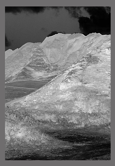
This is too indistinct and over-effected to mean much. Yes, desolation comes through but there's not enough to latch onto for very long. Pic looks oversharpened and the negative treatment feels a bit compensatory. Border is pointless and, if anything, should be black. [4]
This definatly gives a feeling of dread, and desolation. I think you were right to use the invert option, makes it more dreary. The picture does seem a little out of focus, but I'm not sure if that's because of the invert or not.







 Add photograph to your favorites
 Add photographer to your favorites


 Photographer found comment helpful.


